Company
JCMA Inc.
Role
UX Designer + Developer
Duration
2025, ongoing
Team
Software Development
With many onboard features, Milo is a clever internal tool developed on Microsoft Power Apps to provide task ownership, prioritization, project creation, and time keeping.
A disjointed and fragmented worflow experience is hindering management and team members from delivering faster, with too many clicks, items buried in different screens, and the necessity to use external platforms like Excel.
I delivered a new workflow experience for for managers to better prioritize employees' work loads.

Being a UX designer and Power Apps developer presents an interesting opportunity. So does sitting in the same room with the people with which you need to actively research. The nature of these parallels allowed me to really hone in and provide user-centered development solutions that can take Milo to the next level of usefulness.

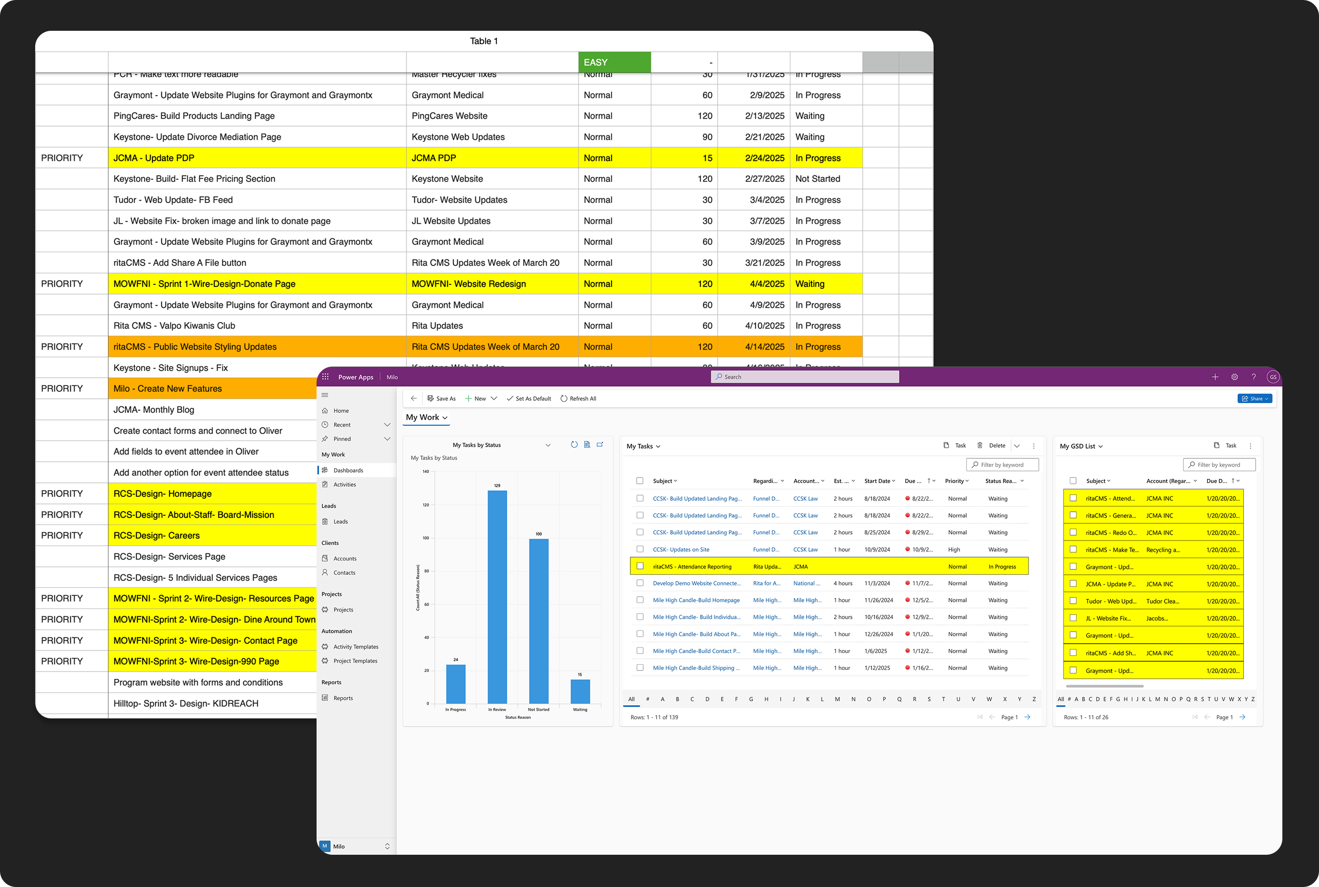
Currently the main projector manager is required to provide weekly scoped lists for different team members in the office. This process involves digesting a list of 800+ tasks across 5 and defining each individual employees direction in the week based on project updates, client feedback, and interal affairs.
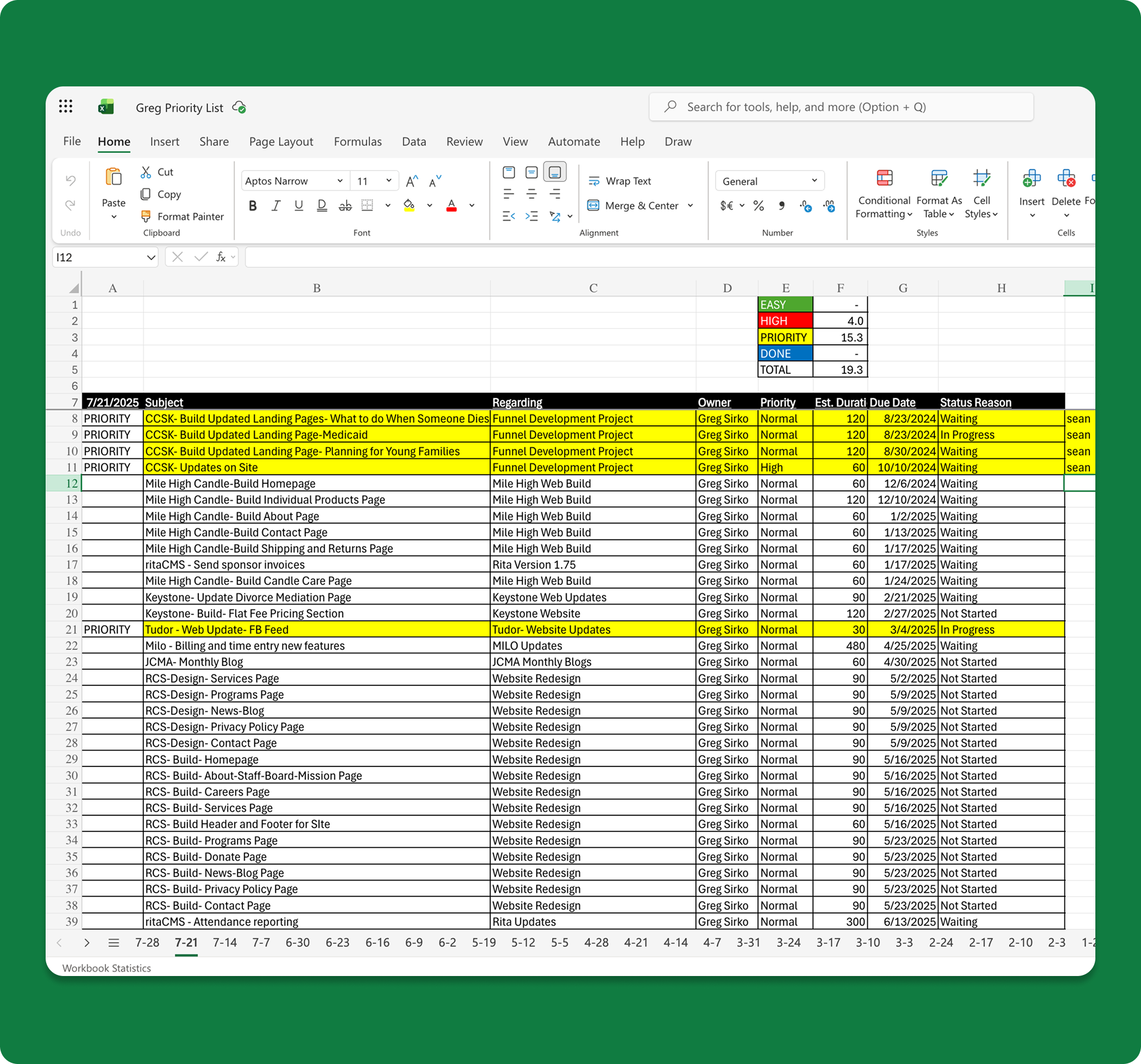
The existing workflow involved pulling a table of Tasks per each team meber out of Milo and manually copy-pasting into Excel. From here a spreadsheet is made uniquely each week per person. Items are stratified based on the severity of their priority level and marked with time estimations. Individual columns for total number of priority hours are also manually calculated. It is a tedious process.
Team members often reported being confused on the existing Milo UI, citing icons (or the lack thereof) as a source of confusion. A lot of unnecessary clicks throw off the mental model of current interface flows.
Relying on Excel and external note-taking methods, emailing, chatting team members/managers, and creating intricate spreadsheets each week defeats the whole purpose. This is a productivity app meant for project management. All of its capabilties should be self-contained.

Team members need a clearer means of being able to sift through their own priorities. This presents the need for slicing and dicing mechanisms based on severity of priority type per task, difficulty of task and time estimation. Team members also need increased visbility around commenting and history of tasks.
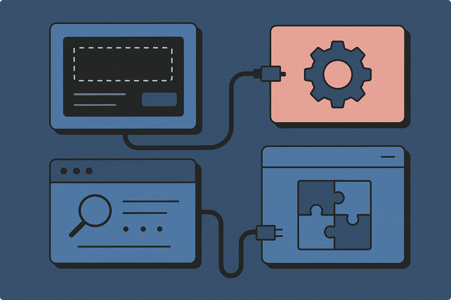
I set out initially looking at different spreadsheets from Excel or Numbers and noted what strengths and opportunities they were affording. I then wireframed in tandem with Milo frames to see how these two could be morphed into another beast.
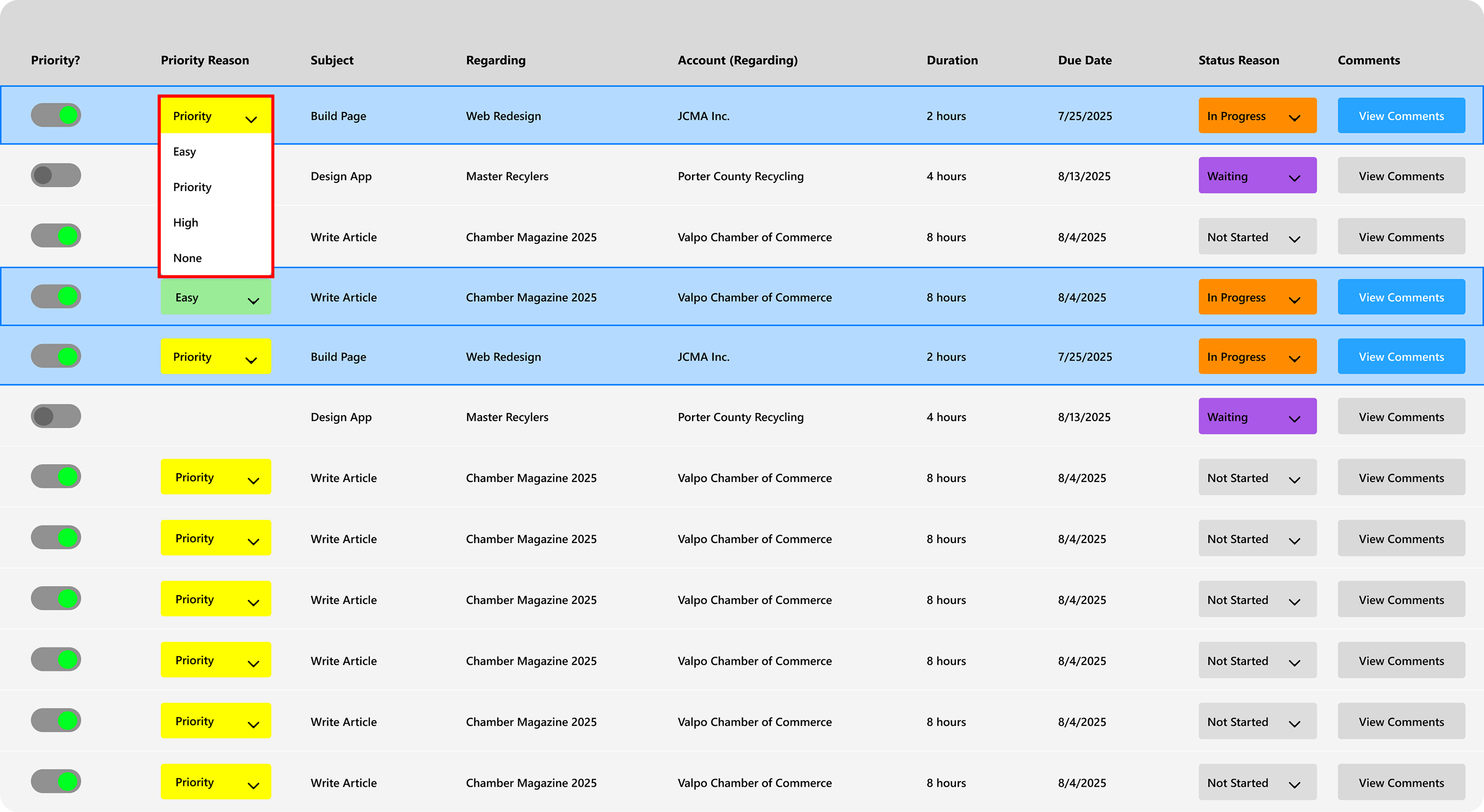
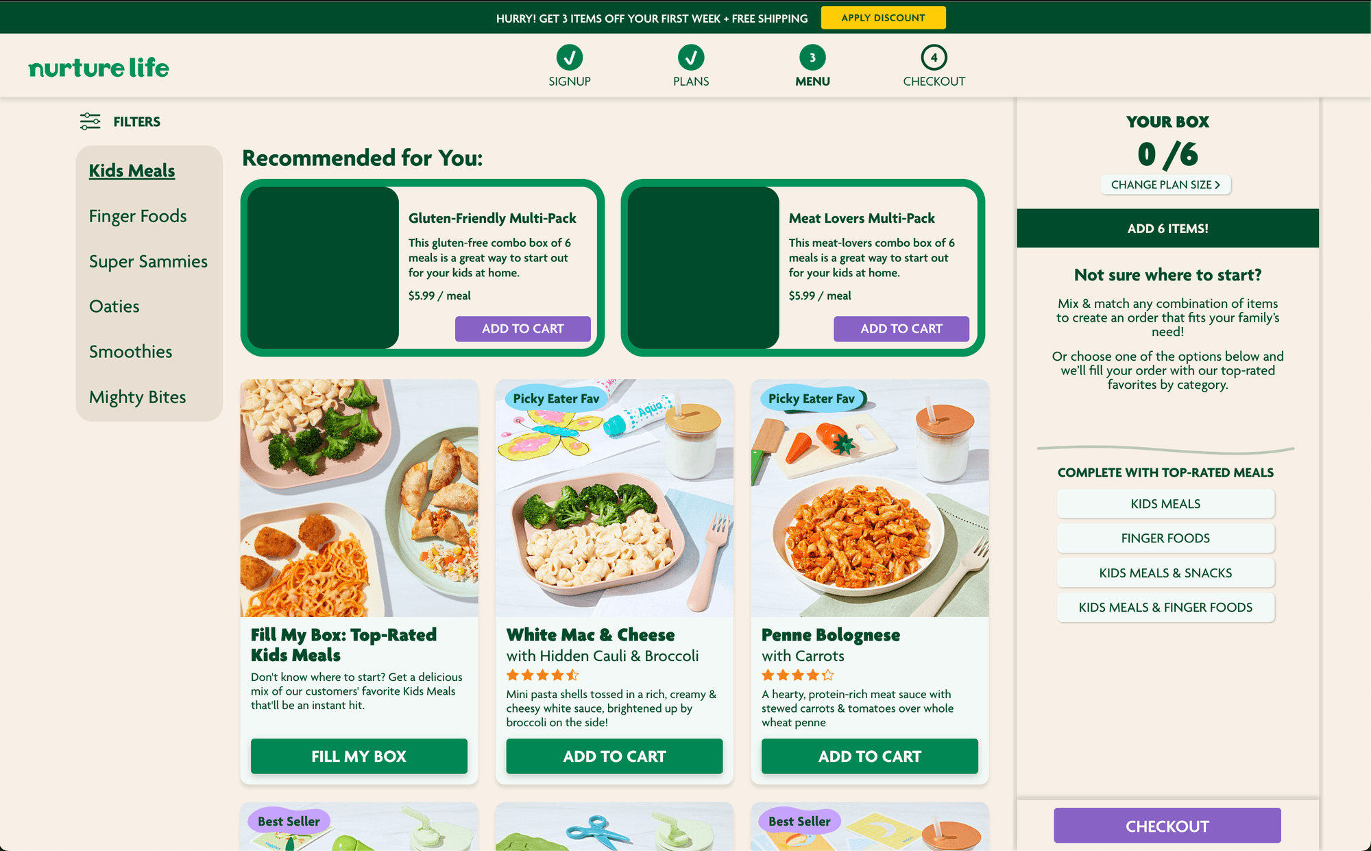
Taking my inspiration from original Excel layouts, I designed my ideal table format for an editable grid in Milo. There is a toggle to add to a priority list, dropdowns for Priority Reason and Status Reason (with new types), and a button to quickly access comments.
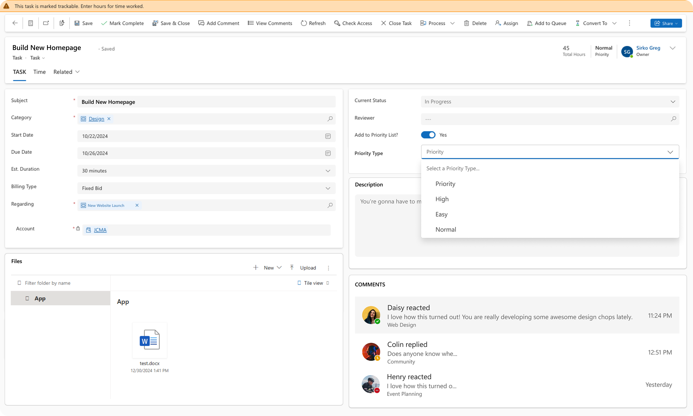
I combined everything together in a hi-fi mockup using Fluent UI Figma components. Comments exist in an in-view module, as well as visual representation for SharePoint files per task. Rollup hours exist here and so do new status types per task.
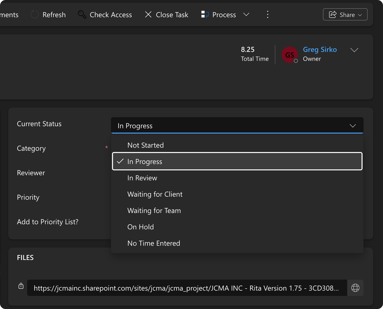
New items were requested and added for better task health clarity and user control. Many options exist to help keep track of where tasks are at now.
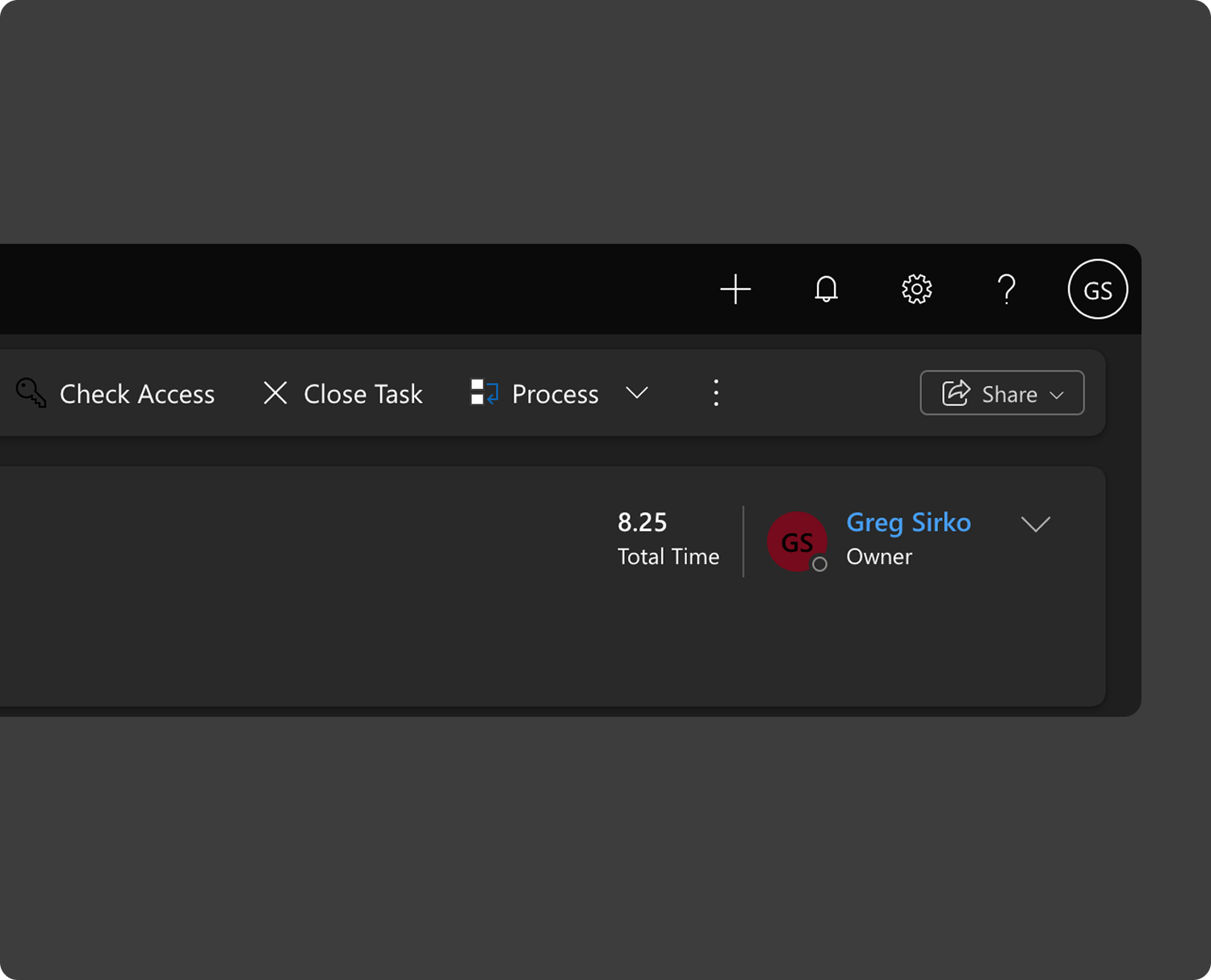
Towards increasing awareness, users can now see a running total of all tracked time per eack task they work on.
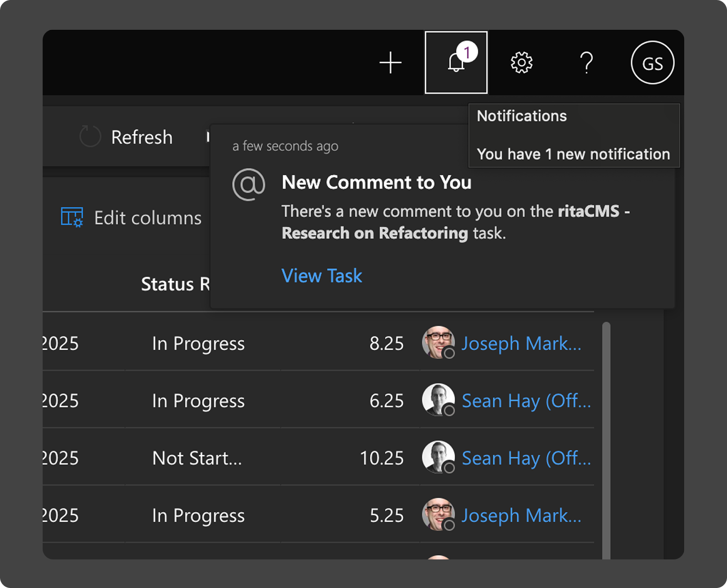
Filling in a huge gap from before, users finally now have an in-system bell icon for new comments and toast tabs that populate the screen. This is a huge win, as in the past we would navigate away from Milo and only see updates through Outlook.
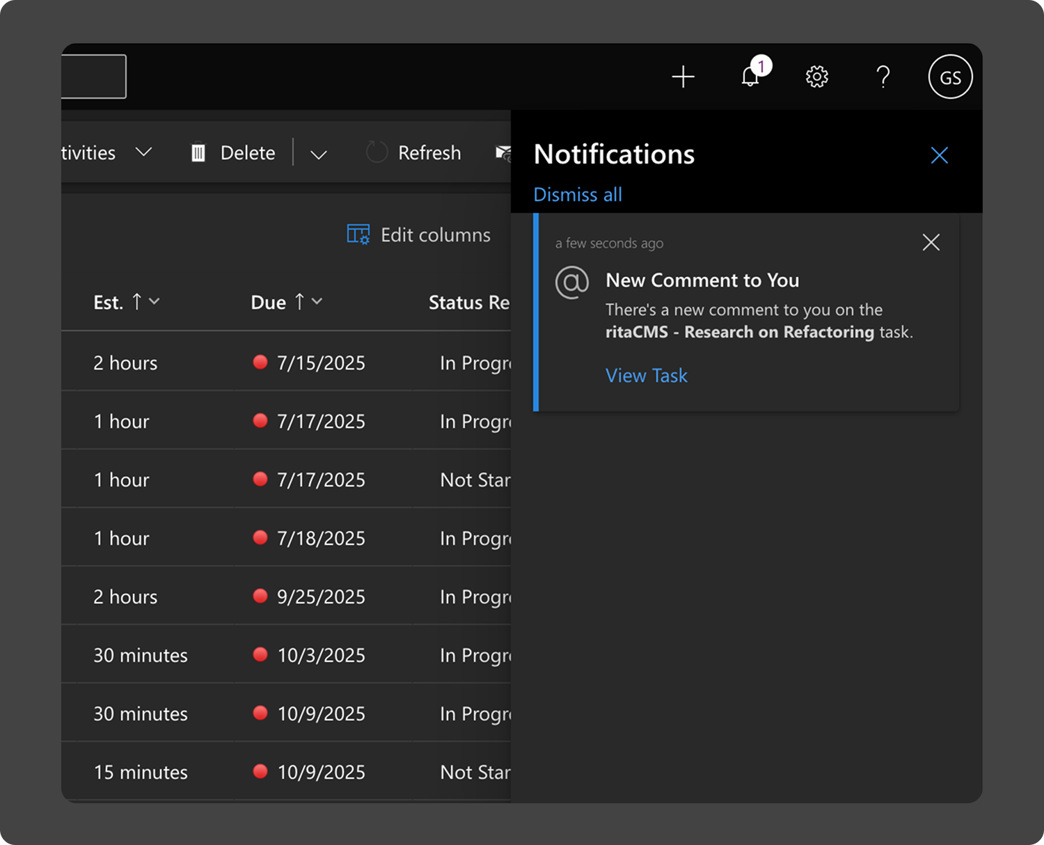
Comment notifications now populate an easy-to-find sidebar. A running history is displayed with timestamps and small snippets.
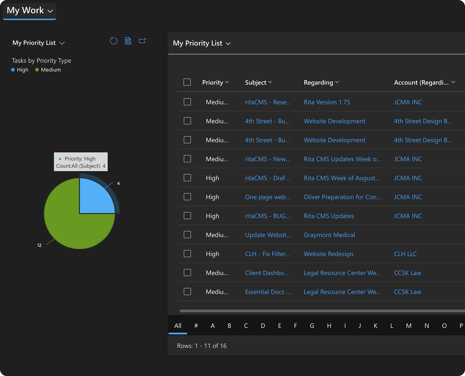
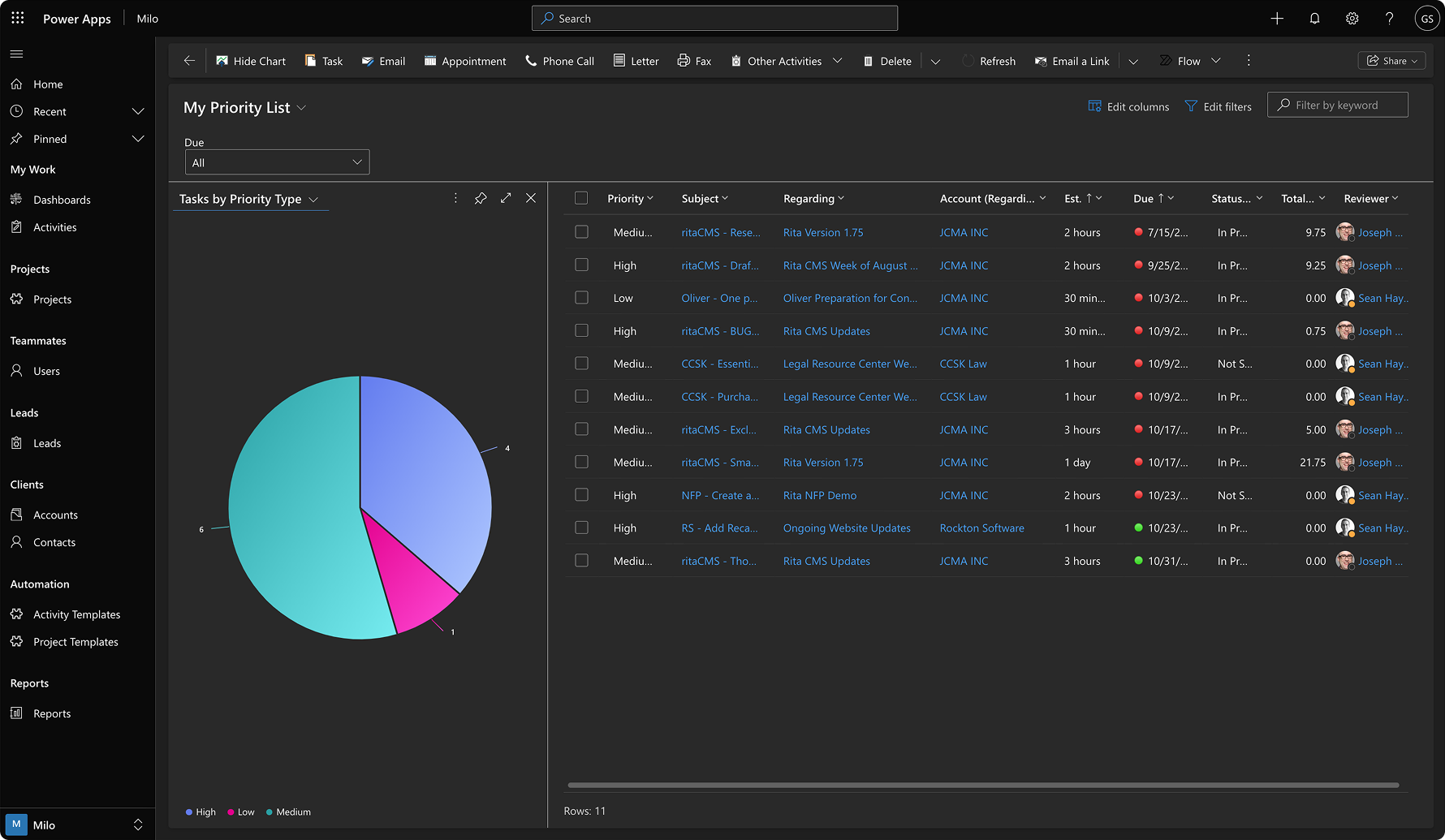
A new dashboard view shows only a list of priortized tasks. In the past, users were inundated with their entire list of owned tasks, even though this included stale tasks or items on hold. Priority types now help to digest the list.
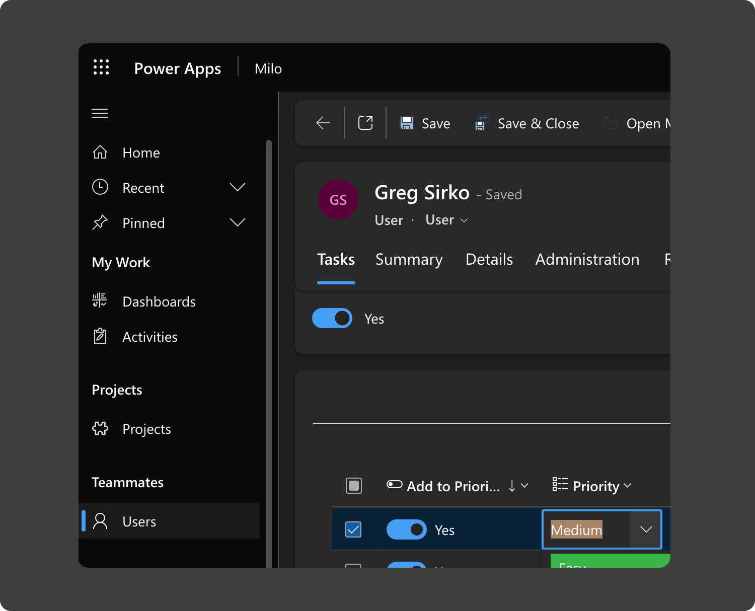
I created a new pathway. A convenient sidebar location of Users directs all managers to a list of each individual. Within that screen, each team member's list of tasks can be viewed and edited.
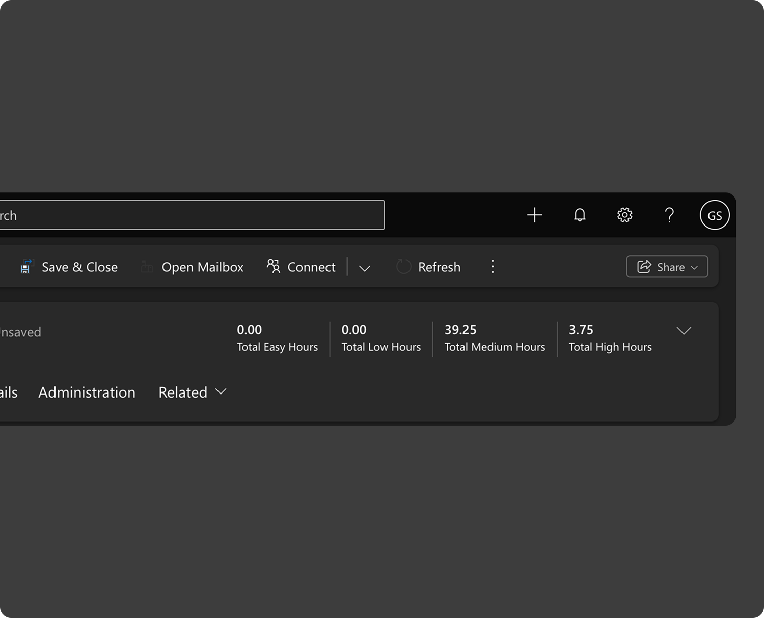
A benefit of the old spreadsheets was having running totals of different priority type hours of tasks. The benefit of my implementation is that now this process happens automatically based on calculations onboard the system. Presenting this forefront keeps a great view of each team member's workload.
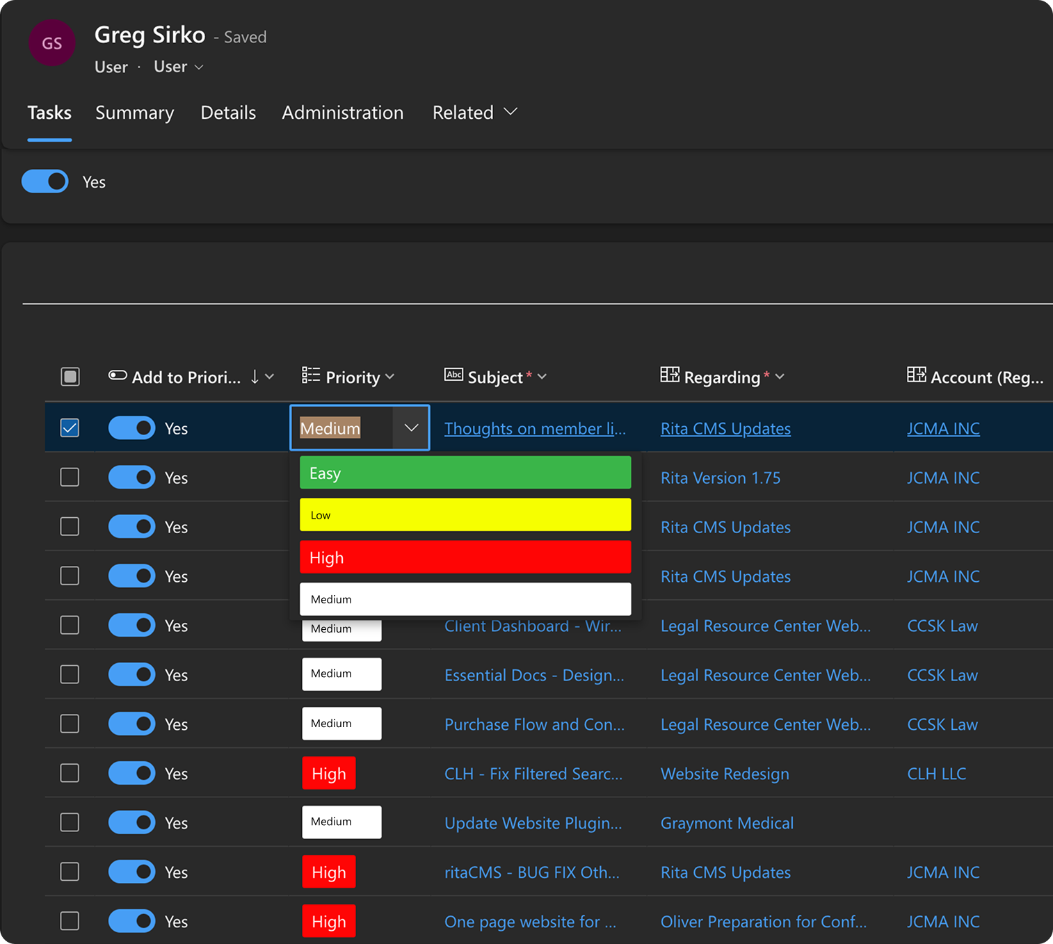
A huge win for the team is having an editable grid exist for a user's table of Priority Tasks. This allows managers to edit tasks on the fly with new information as it comes in, creating a more agile and lifelike environment in Milo.
"I spend more time completing work
and less time managing HOW to do that work."
"Where projects and tasks are at on the pike is much, much clearer now."
hrs saved weekly per manager
Let's take a moment to reflect on how the journey of this design and development shook out. All in all, I was happy with this project, and so were my bosses!
The implementation for an editable grid with inputs on each field (User Form Priorities) came from an internal component within Power Apps. Finding this really helped materialize my dream for the app.
Straying outside of user stories and scoping marginal feature updates is extremely easy to do, but delays the delivery of essential implementations. Something of which to be wary.
The component for a visual file repository within the Individual Task View was removed due to issues with the existing Power Apps Component Framework (widget). Some development work in JavaScript will be forthcoming on that.