Company
Nurture Life
Role
UX Designer
Duration
1 Day
Team
Self
A growing market for healthy and quick meals spawned the birth of Nurture Life, an eCommerce subscription website.
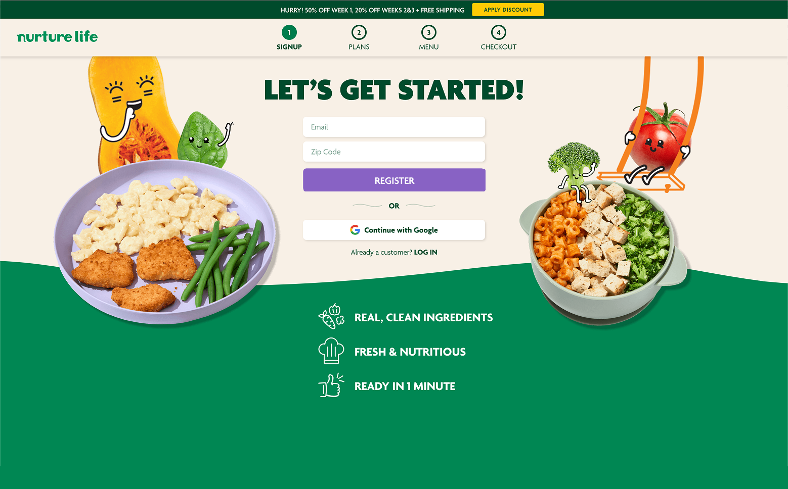
Not enough users are signing up for account creation. A subscription plan exists, but more users need to be engaging with product and signing up.
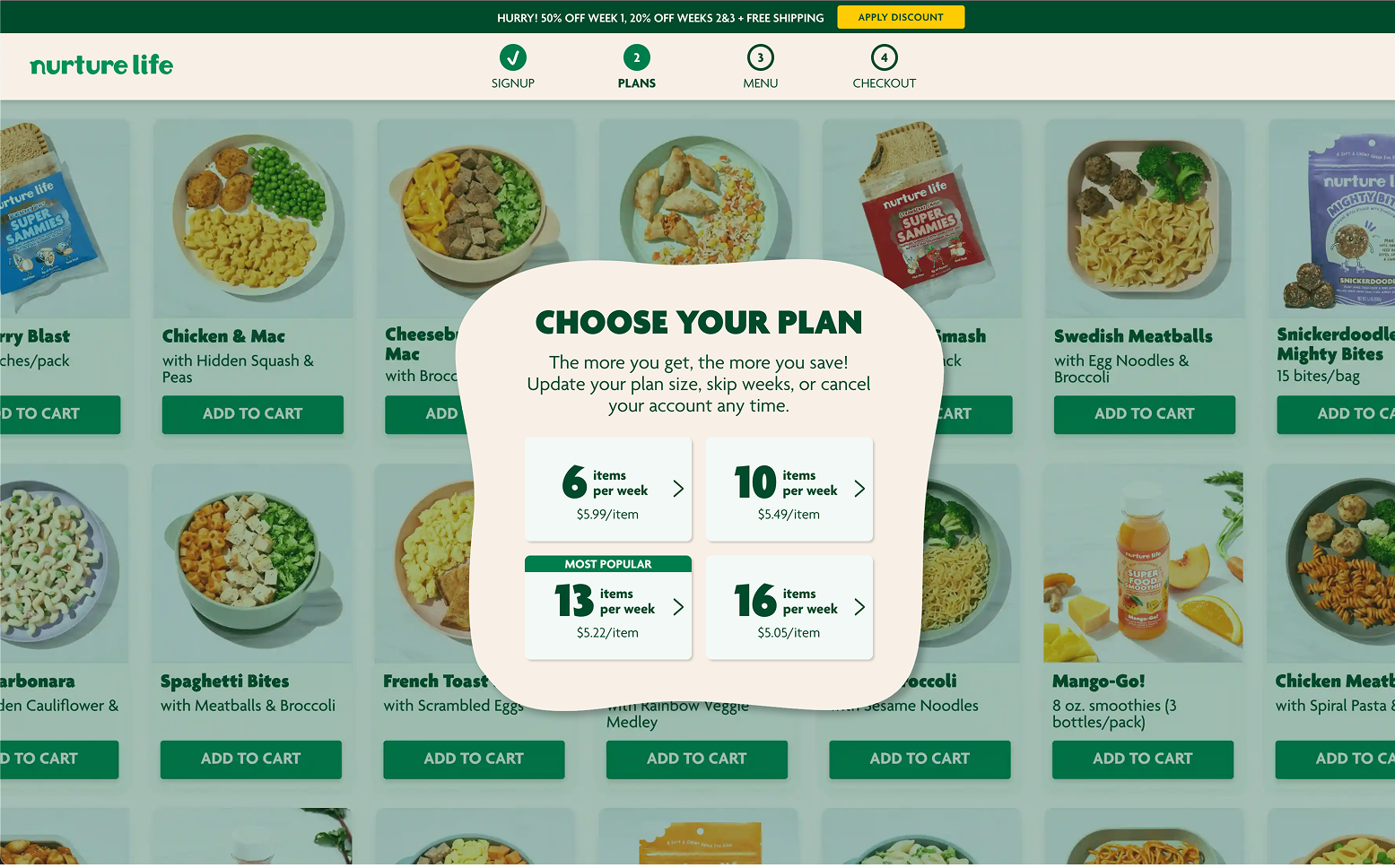
I designed three different user flow experiences to address three different levels of user engagement to get users to engage with the brand incrementally to develop more of a relationship that would lead to account conversions.

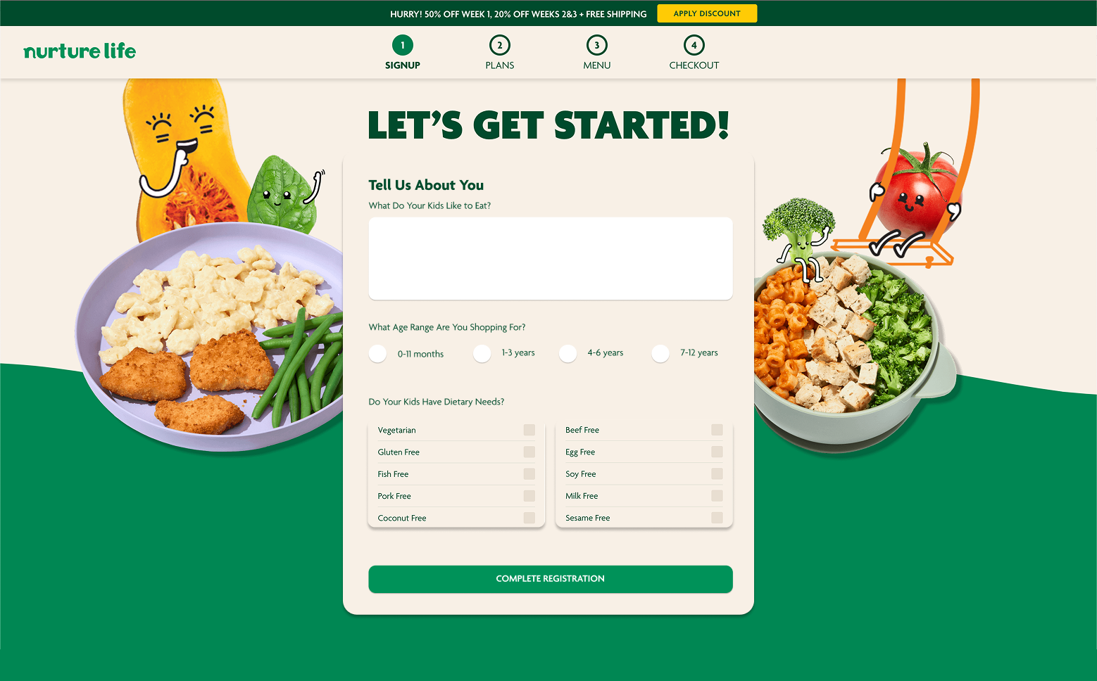
Kids are picky. Kids have allergies. Parents want easy options, but don't want to give up too much of their own information.
An optimal blend of user conversion tactics combined with user-centered fundamentals will help parents start to engage with the Nurture Life products yet still allow different user profile detila to be gleaned. These include things like the kind of foods kids like to eat, what products sell well, what ages enjoy different items. So on.
Depending on your bias, there are a few ways to look at AI. In CX, our best intentions are in understanding how generative and algorithmic agents can integrate into our site to most effectively aid the user journey.
Where along the customer journey can AI tools fill in gaps to surprise people, save their time, and provide clarity?
People like familiarity. People like having their own version of something tailored to their needs. Think of sharing a car with others and the need that arises to constantly adjust the seat back and forth.
We endeavor to improve the customer journey with recommended content/products, saved options (to revisit quickly and easily), and form data that auto-fills. Explore: tactical segmentation and hyper-personalization.
People enjoy consistent expectations across channels. Our web shopping experience should be consistent with our mobile version.
People also like things to be easy. We need to ensure that the customer journey in general provides a clear, quick, and engaging process that gets customers what they want and need. We don’t want users to give up in the middle.
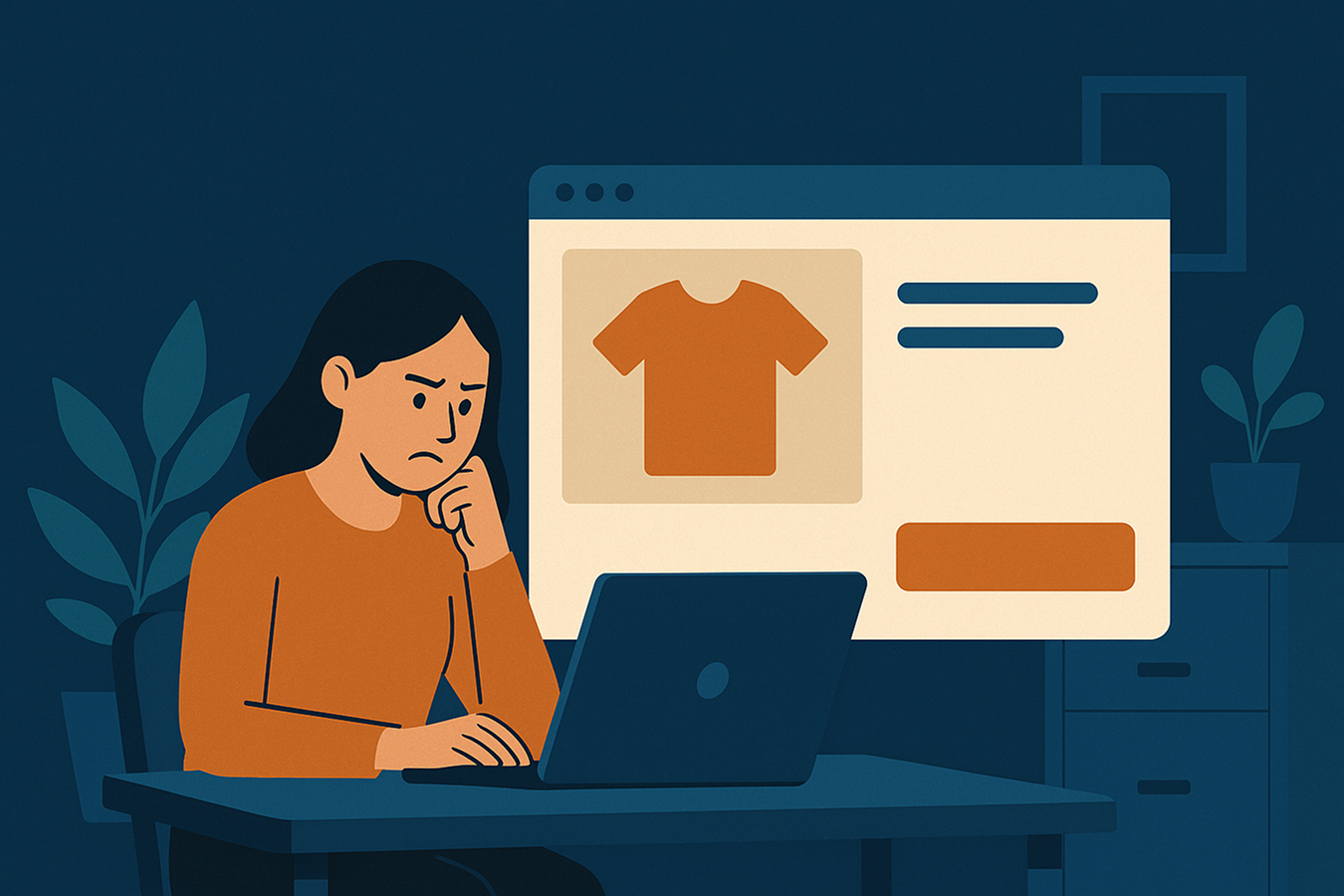
Users tend to abandon their shopping experience by annoyingly invasive prompts to sign up for newsletters, give an email address, or navigate away from the current page.

Online shoppers will not go through any experience that loses their interest and attention. People like to get the products they want quickly. If it's too clunky or difficult, they will just reorient and navigate elsewhere.
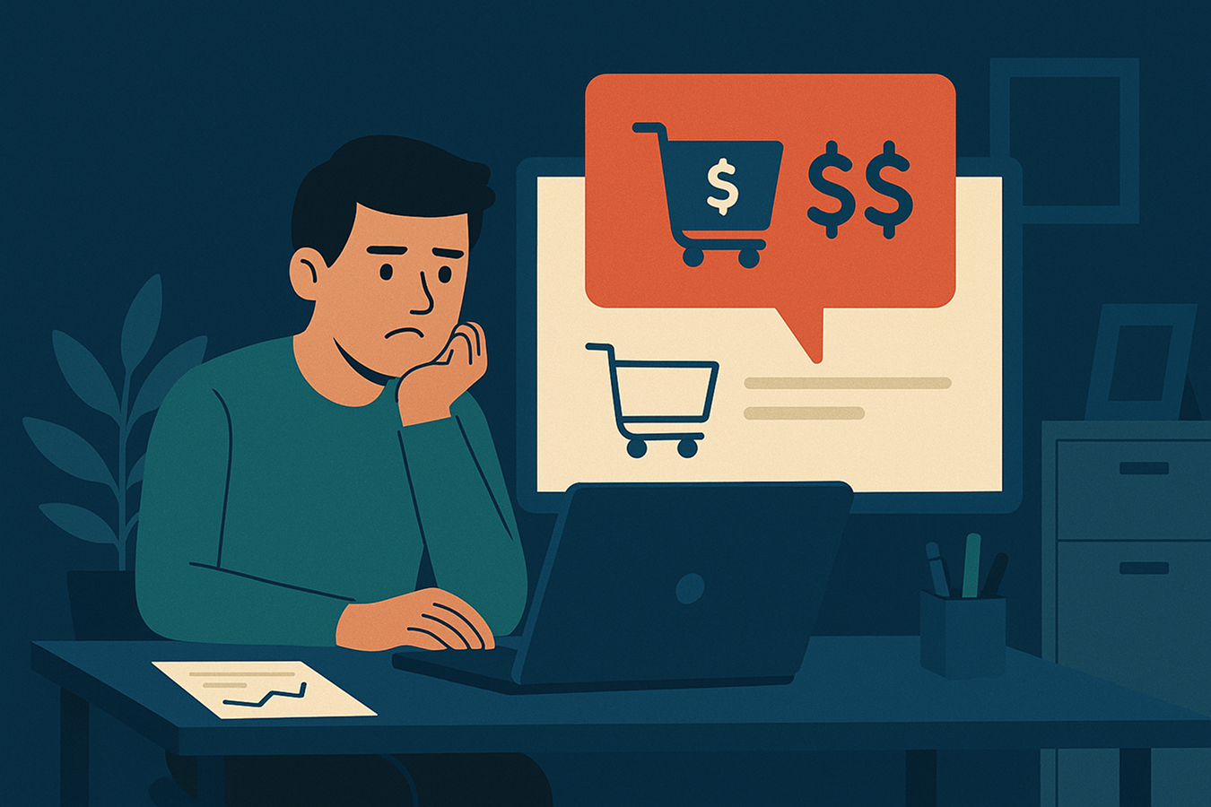
If different costs outside of the individual product base like shipping, costs, extra fees, and service charges are high and unexpected, shoppers will abandon the cart.
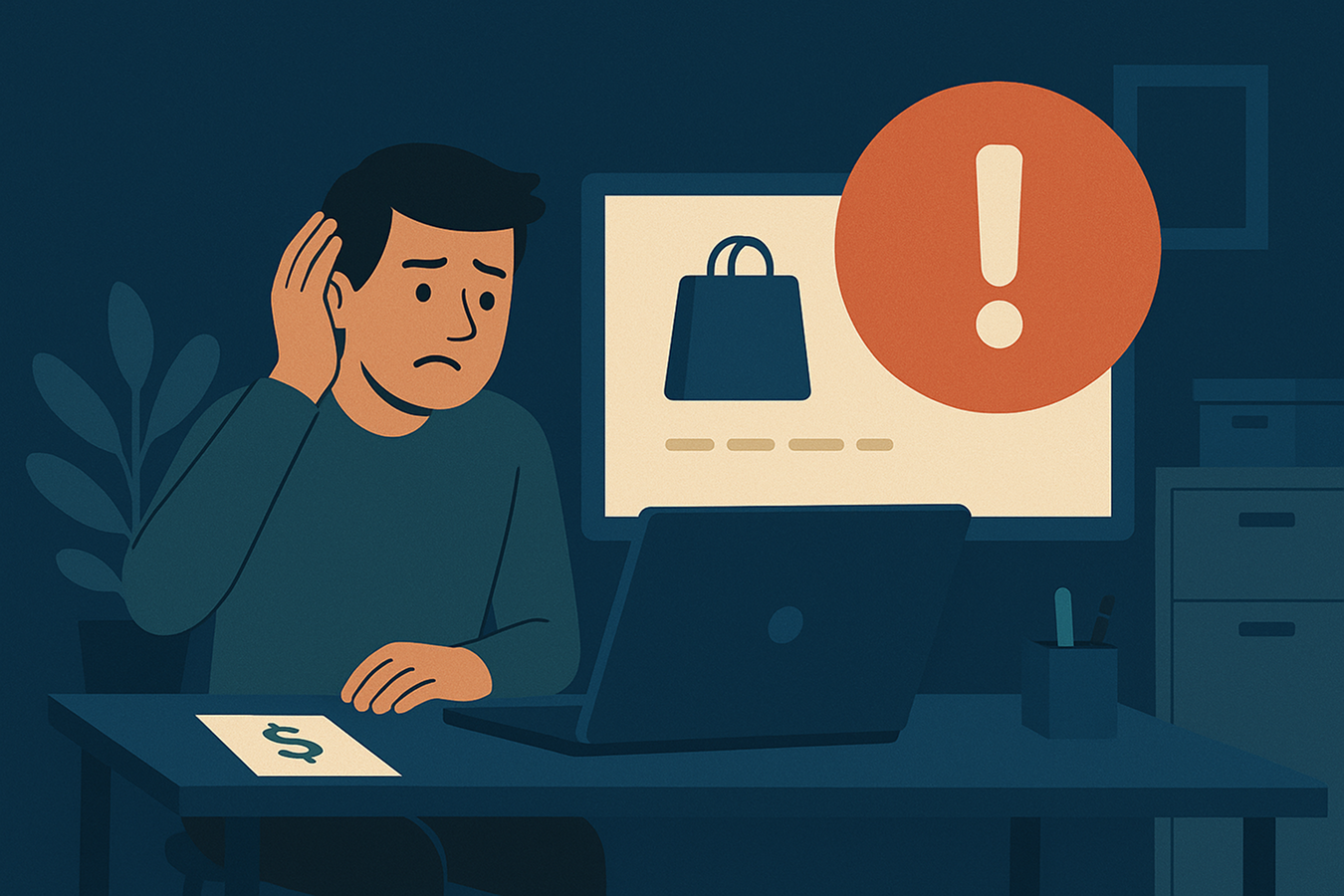
If the total cost of every single included fee and item is not calculabe in a sum amount, users will get confused and lose trust in the shopping experience. This distrust fuels uncertainty, which prevents a user from completing the checkout.
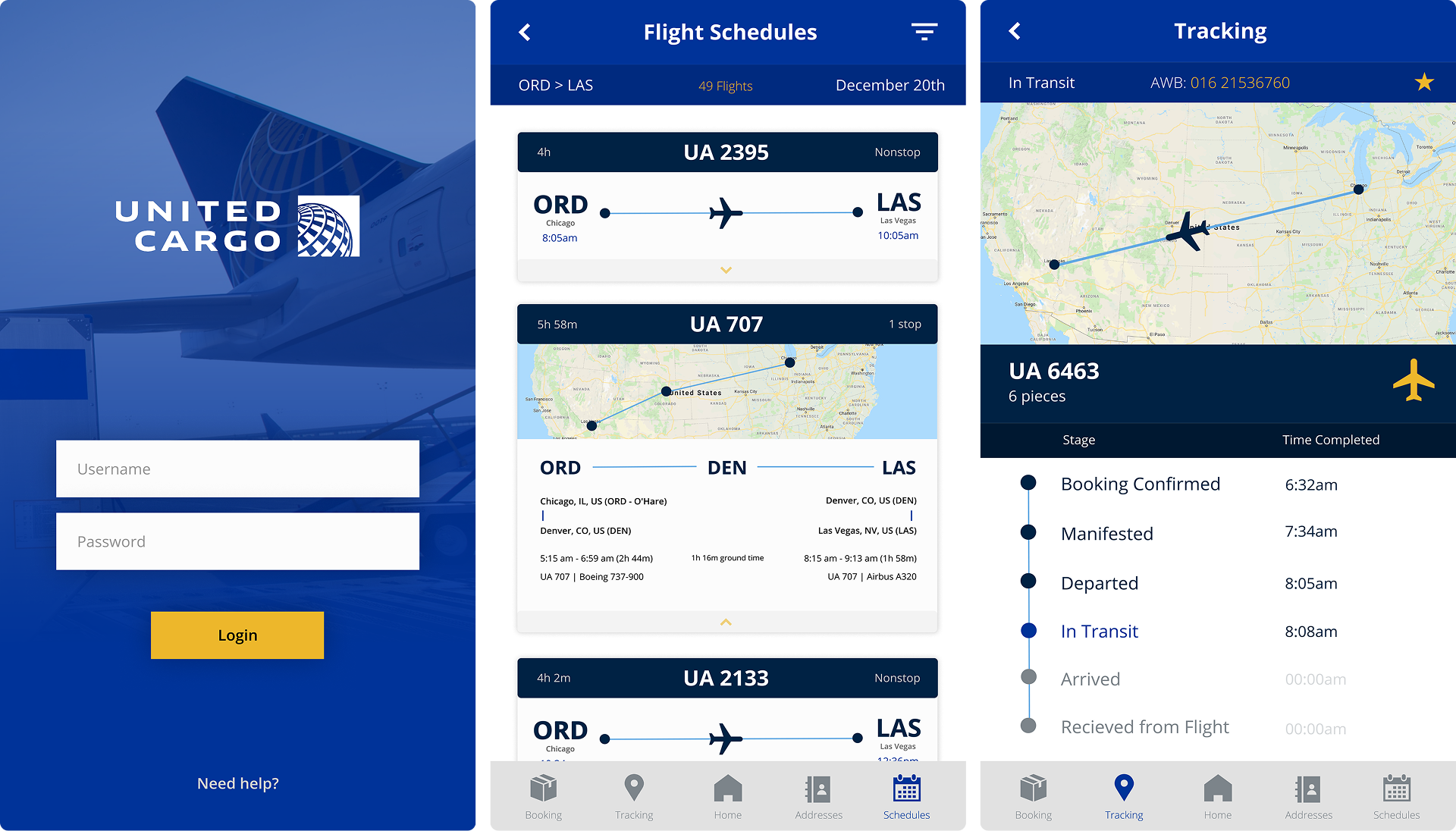
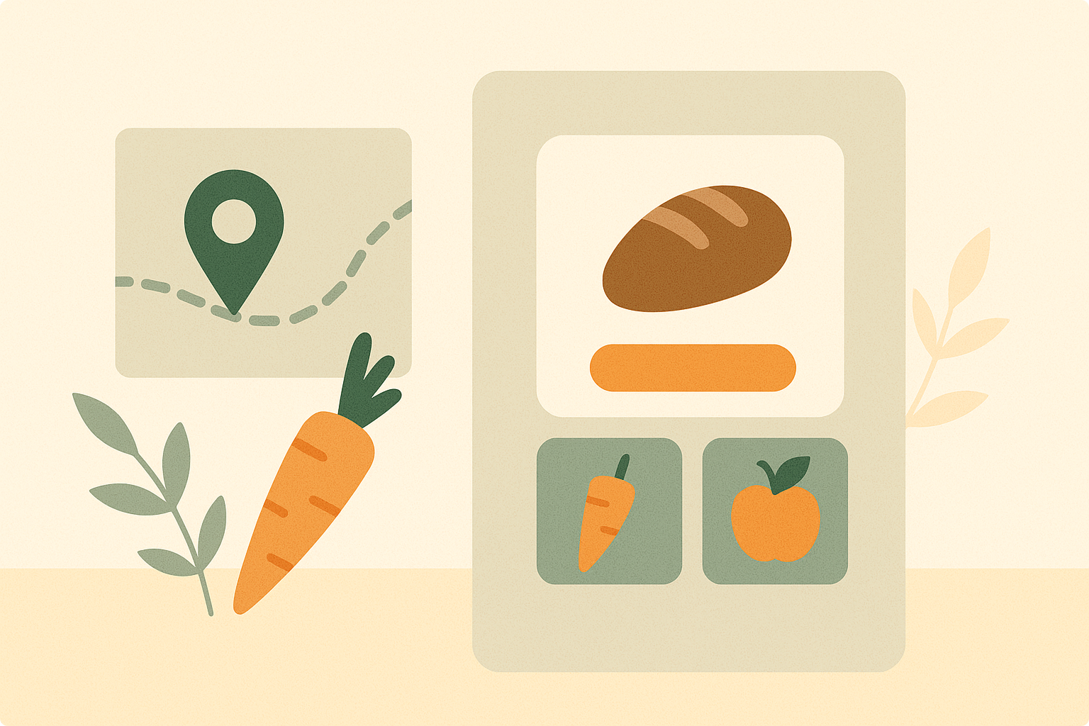
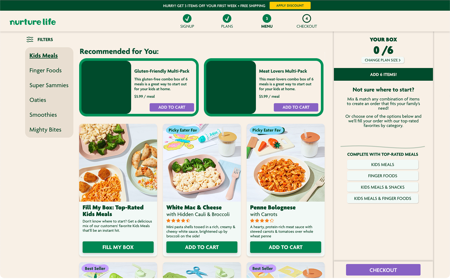
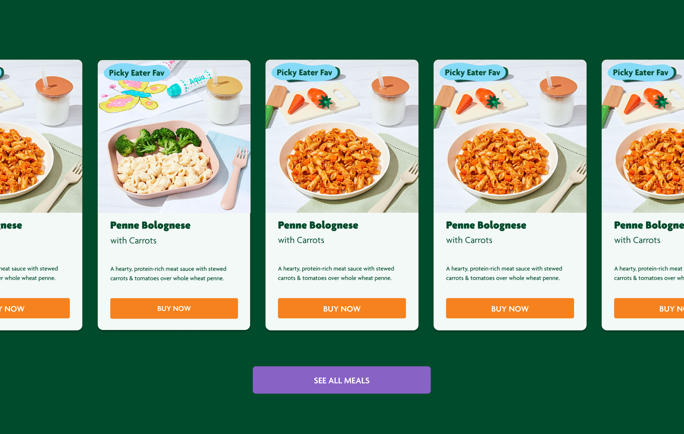
Once a customer has built out a profile, algorithms on the platform can enage in recommdations. New items pleasantly and conveniently presented to customers is an effective use of artificial intellingence in experience design..
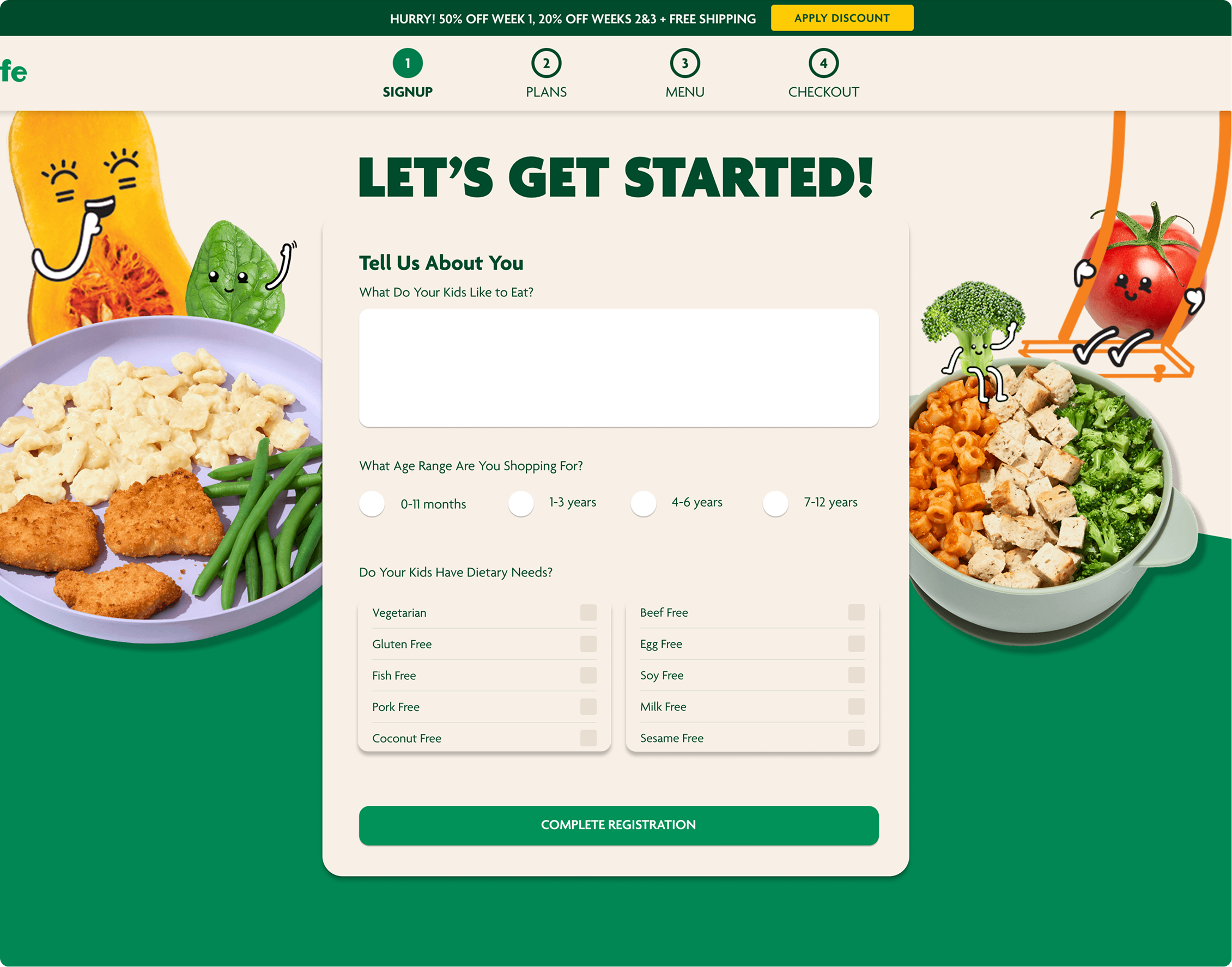
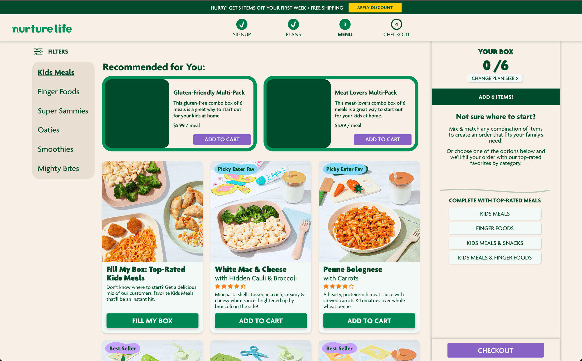
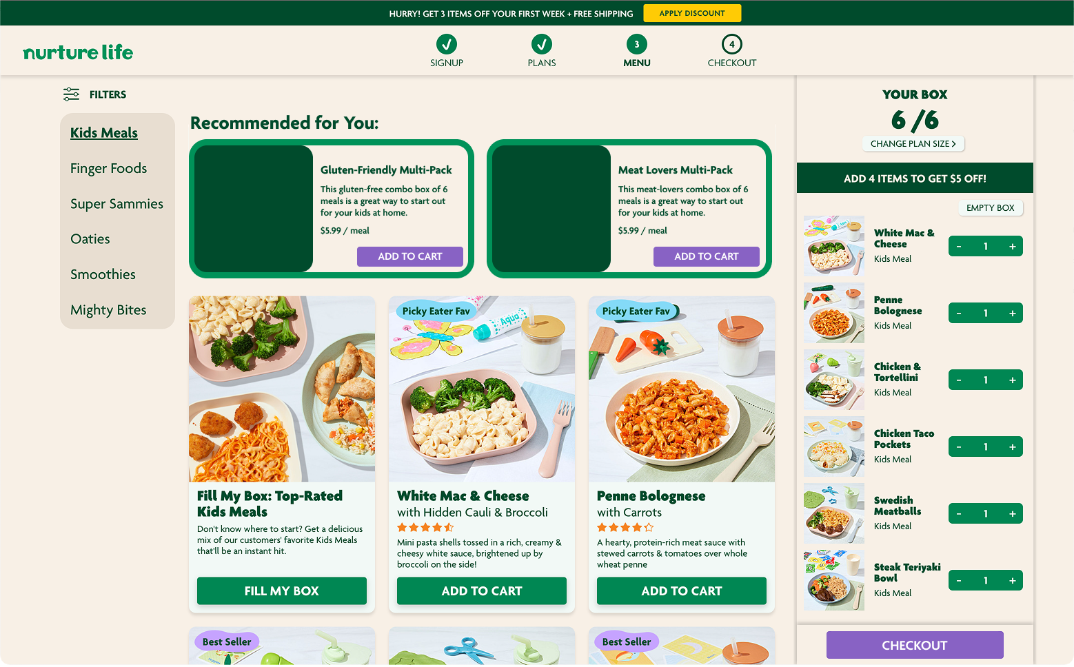
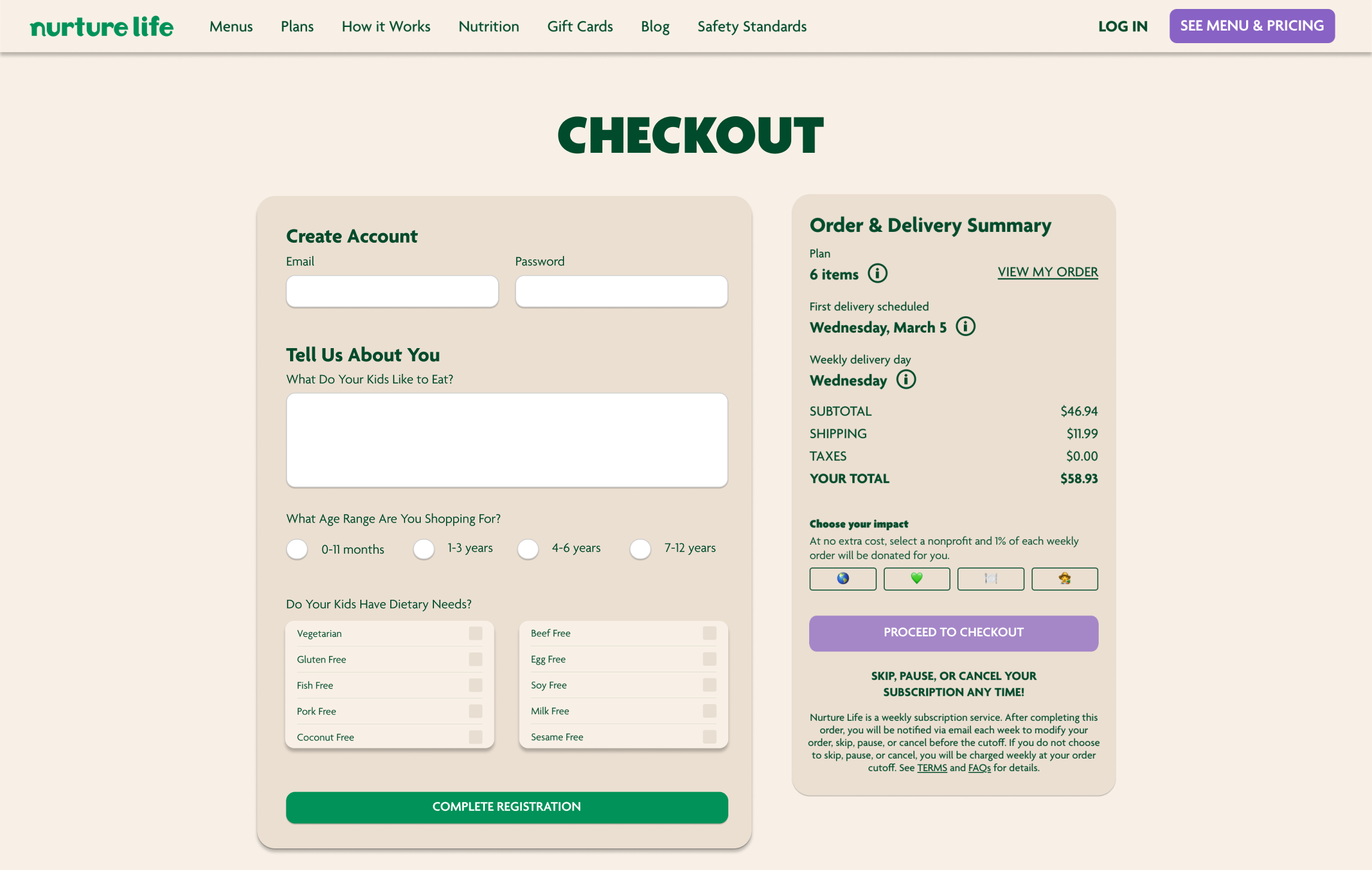
Once users have ventured into profile creation, a profile form is presented. This iteration is an improvement on the old. Age ranges are presented as choices instead of specific numbers. Dietary restriction items are presented for further product recommendation in the future. And general notes on favored cuisine are also captured.
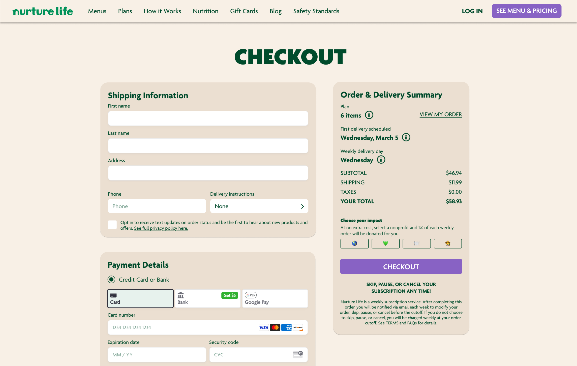
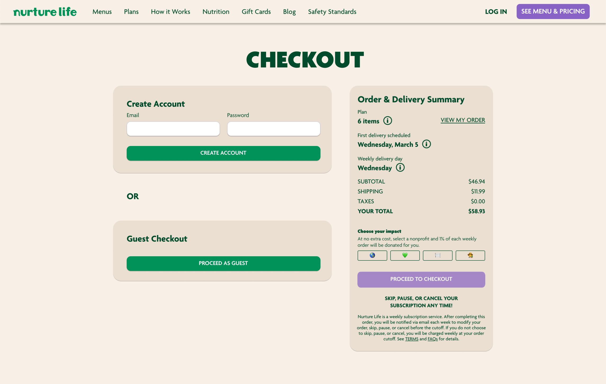
If a customer desires to sign up within the checkout process, a prompt is situated here.
This nudging within the checkout allows users who are warming to have a chance at signing up.
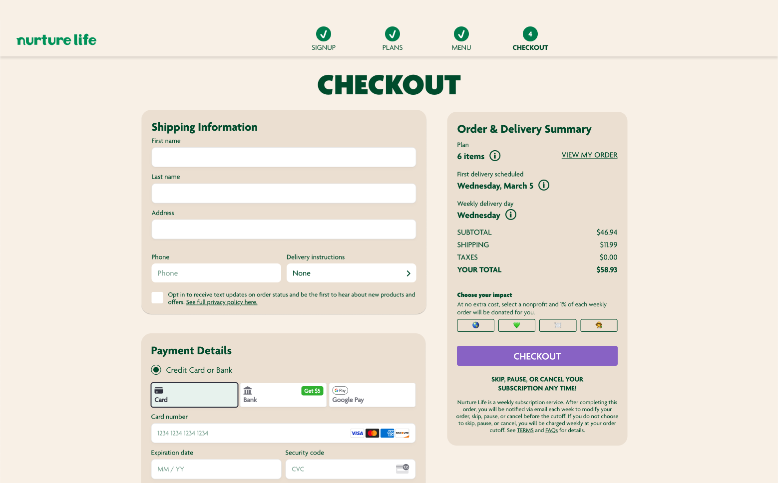
If a customer desires to sign up within the checkout process, a prompt is situated here.
This nudging within the checkout allows users who are warming to have a chance at signing up.
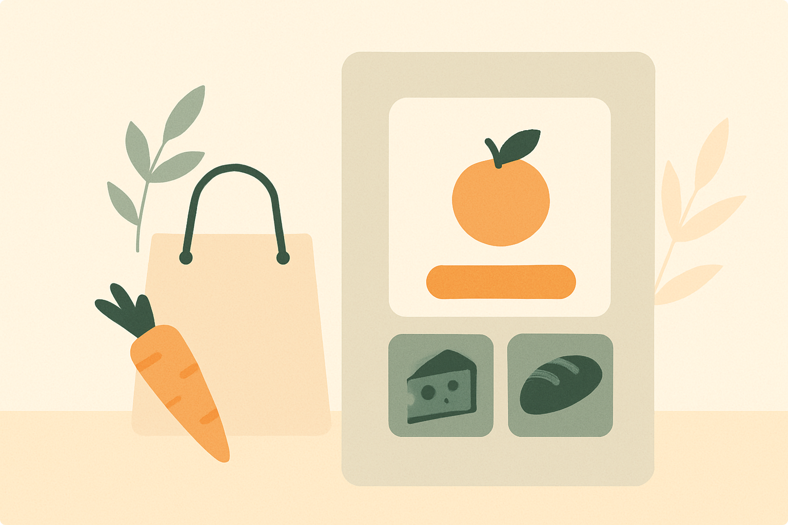
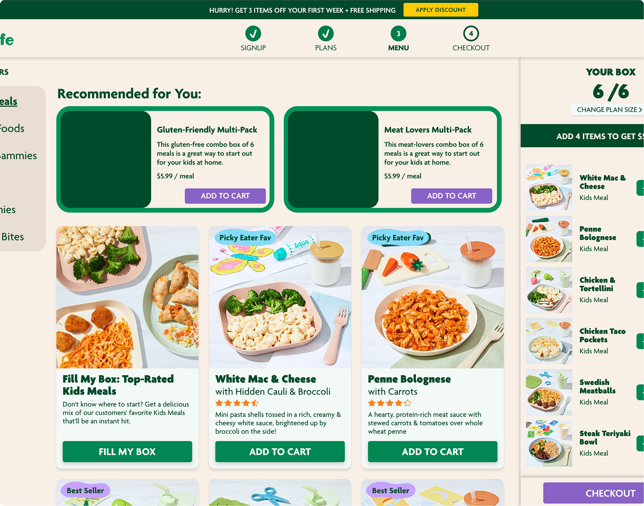
In order to entice users who are more agnostic or anonymous, one click to buy options are presented on products. This allows newcomers to get situated in the ecosystem and try Nurture Life products.
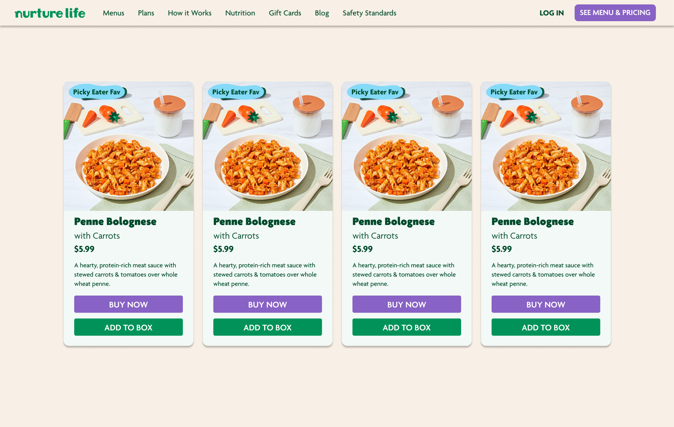

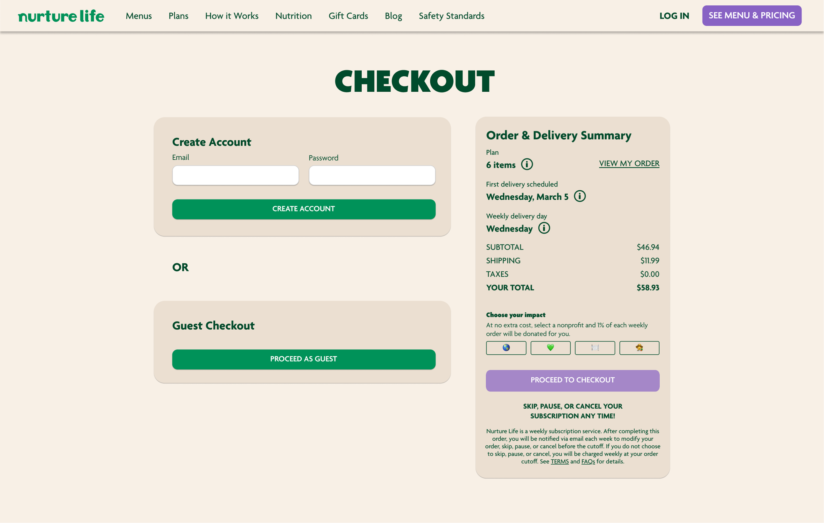
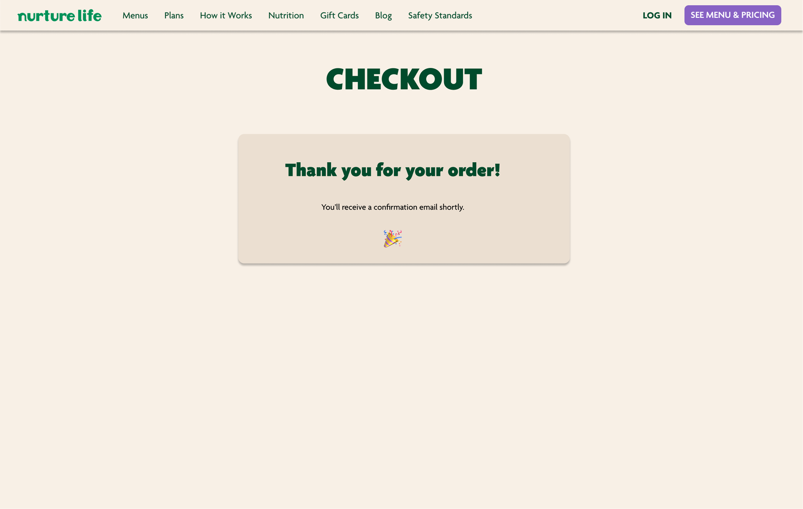
If a customer wants nothing to do with sign up, they can simply guest checkout.
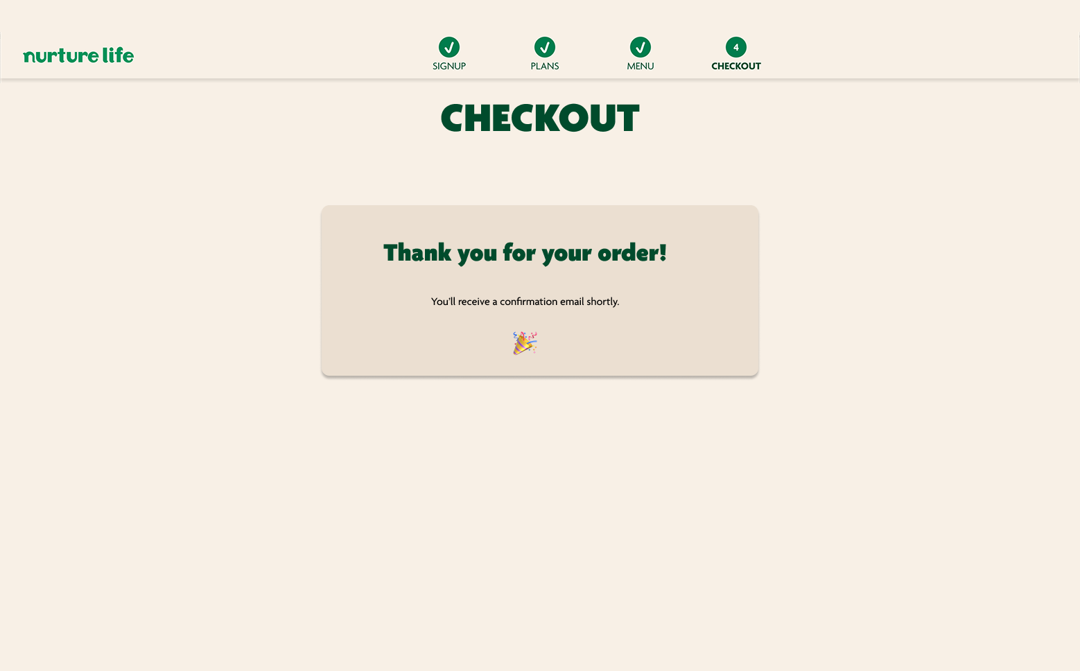
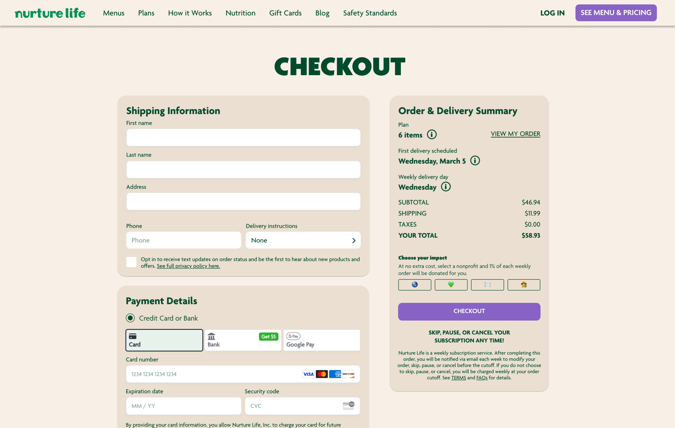
One click checkout leads users to fill out their billing and shipping info and compelete the transaction. This process is quick, offering three clicks over two screens, and bypassing the entire account creation scenario.
Customers can quickly speed through the checkout process if they simply wish to buy a produxt, try it out, and not sign up.

Different Customer Experience Journeys can be fine tuned to attracgt and retain different market segments.
NL was previously missing a huge opporunity for business by restricitng all sales to account subscription plans.
A comprehensive webpage employs different tactical segmentation opportunities to entice differnt kinds of customers--the timid 1-time shoppers to the dive-in subscribers.
A chance for reflection on this past work allows me to grow in the present and future of my design work.
It was really fun to do ad-hoc research work for this (secondary eCommerce research, pain point identfication, and quick-and-dirty interviews.) Aligning my design work across different segmented tactics was also a stroong exercise because I could define essentially three different users profiles and still manage business goals around each one.
What I would improve about this project probably falls down to further benefits for personalization. I'd like to have designed what benefits could be designed for access only after a customer subscribes with an account. It would be cool to show breadcrumbs of those via small marketing or ad targets ad entice customers to sign up better. I thinnk that was a missing piece.
Were I to continue this project I might consider building out a front-end shop experience in React to see how these experiences feel. In design I'd also like to explore the aforementioned ideas about member perks--how could I advertise and build small micro-enticements or gamified rewards that customers could achieve after signiing up with an account.