Company
United Airlines
Role
UX Designer
Duration
4 months
Team
Purdue UX
The air-freight division of United Airlines, United Cargo operates via seven major U.S. hubs and a global network that reaches over 100 destinations.
United Cargo operated only two different web tools for their cargo management side of business, whose unresponsive nature on mobile devices hindered and eliminated further possible use cases and experiences.
With a team, I delivered a mobile app experience that bridged a critical mobile computing opportunity.
In my undergraduate program at Purdue UX Design, cohorts gained exposure to industry settings through different real-world problem prompts every semester.
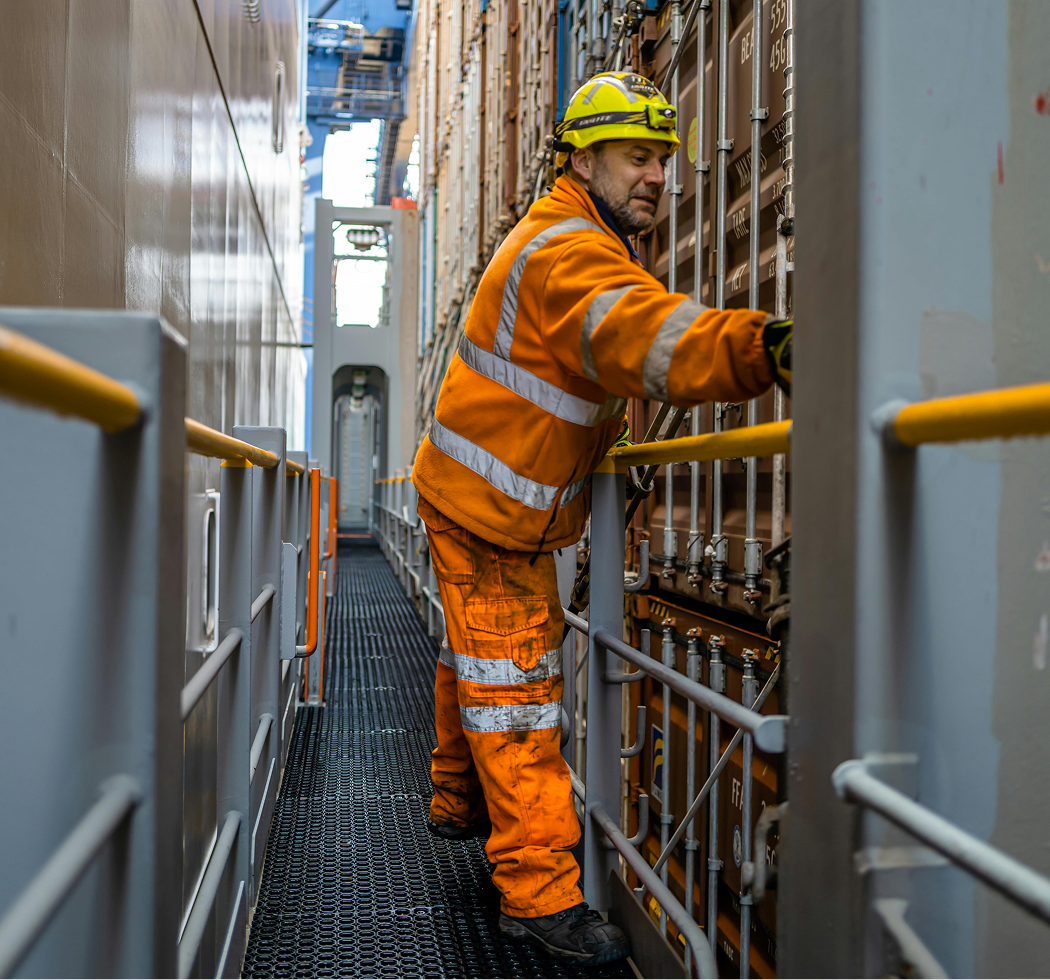
The operational habits of target users, cargo managers, needs to account for a lot of in the field and on the feet app usage. A smart, easy, and deceptively powerful app needs to exist.
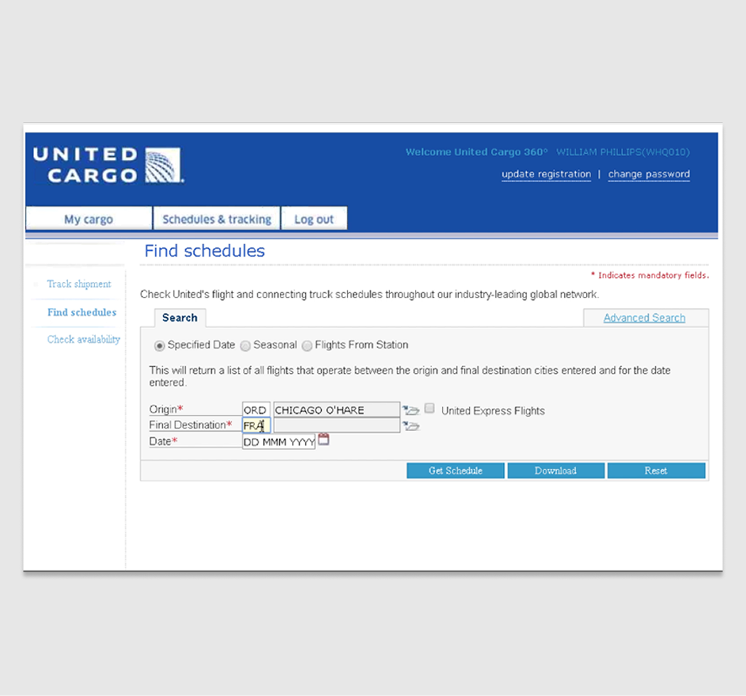
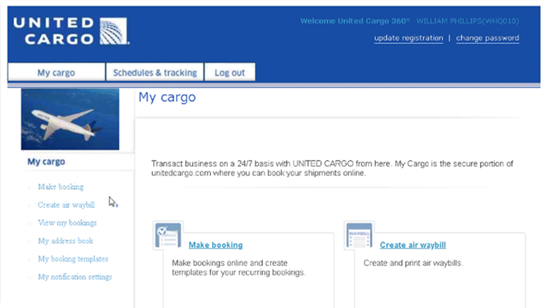
The current United Cargo eCommerce web platform that cargo managers use is very outdated with a clunky UI and brand and lack of responsive layouts.
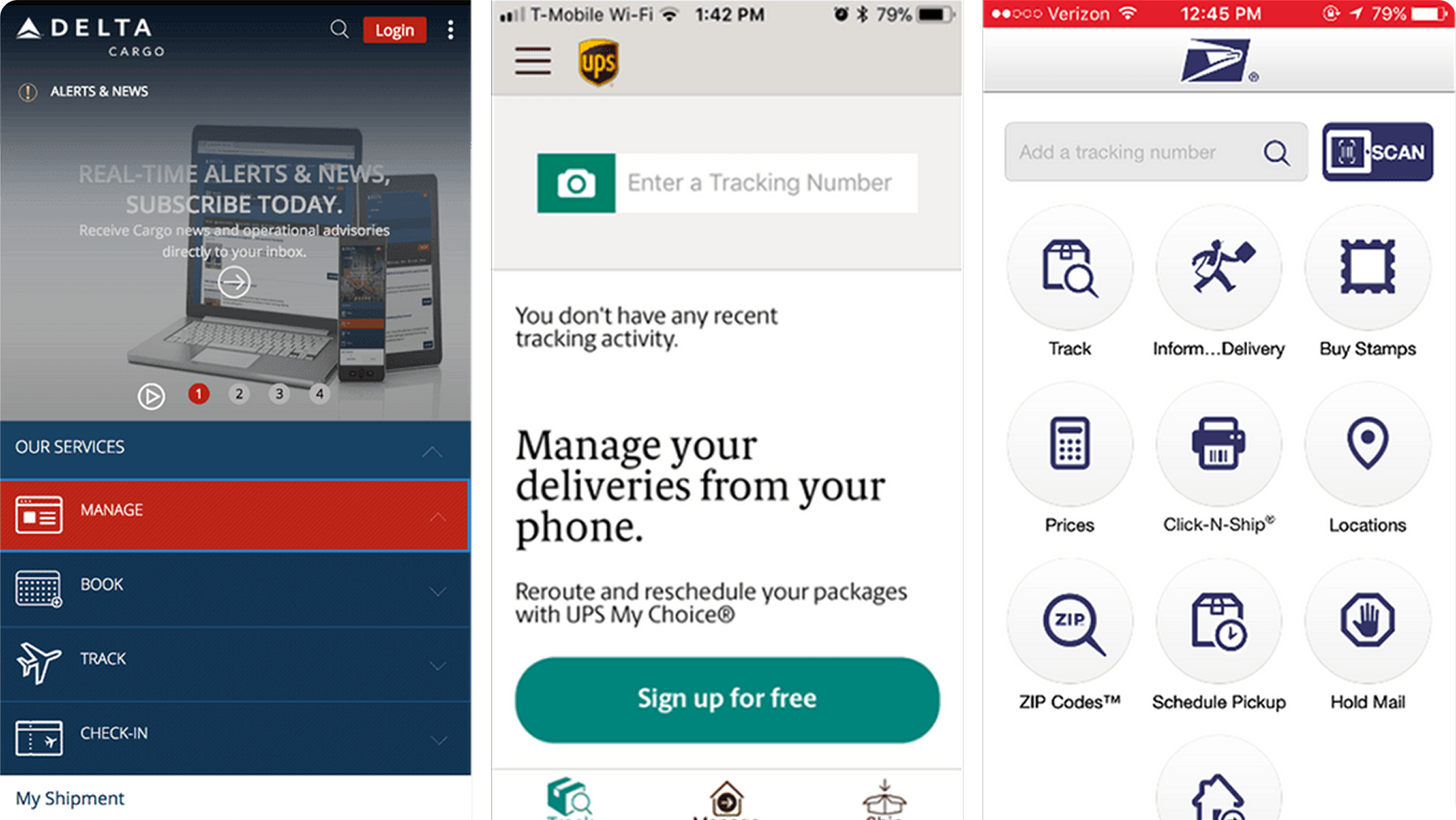
A competitive analysis of leading industry analogues for shipment processing and tracking led the team to a few key insights. Large, obvious UIs exist with clear, easily pressable buttons and smooth flows.
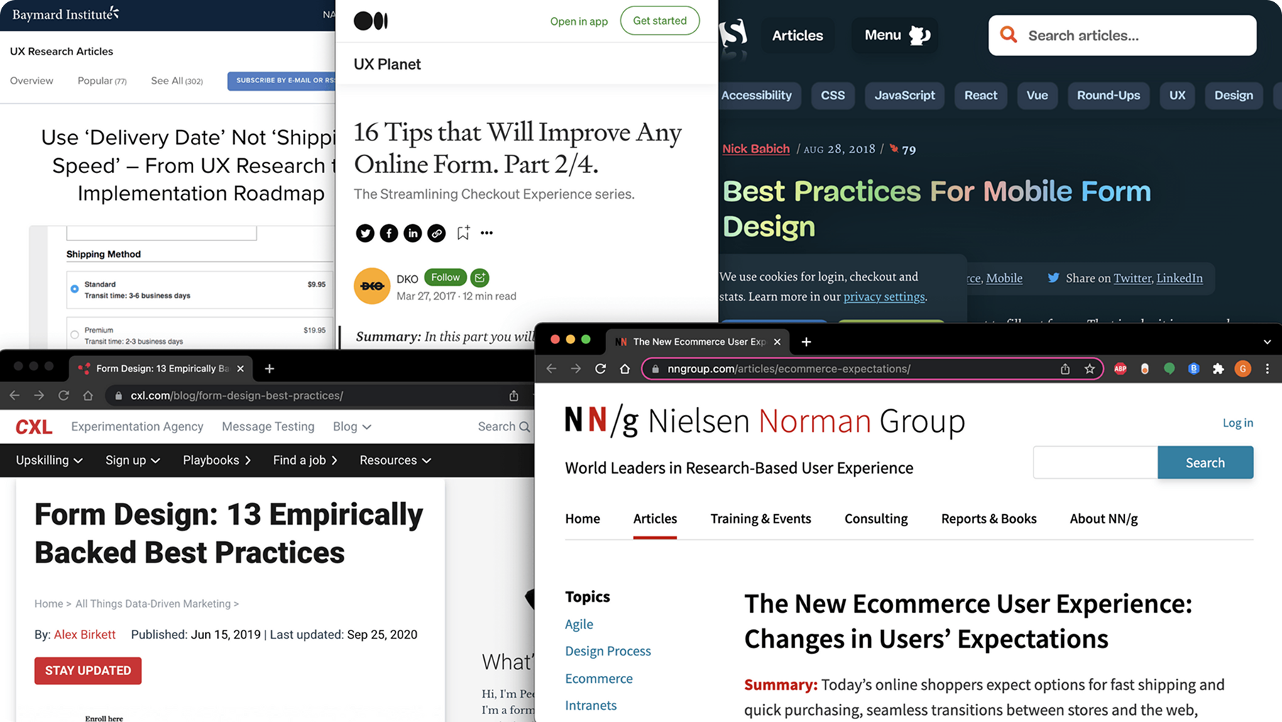
Robust secondary research led me to understand the importance of form design. The journey needs to be broken up across different screens where possible, as users primarily like to tap and advance on mobile contexts.
The existing web tools are an outdated, unsuable platform that don't fit into a modern lifestyle with mobile computing in unexpected contexts. Our team gleaned the primary core functionalities of the website to uphold in our own design.
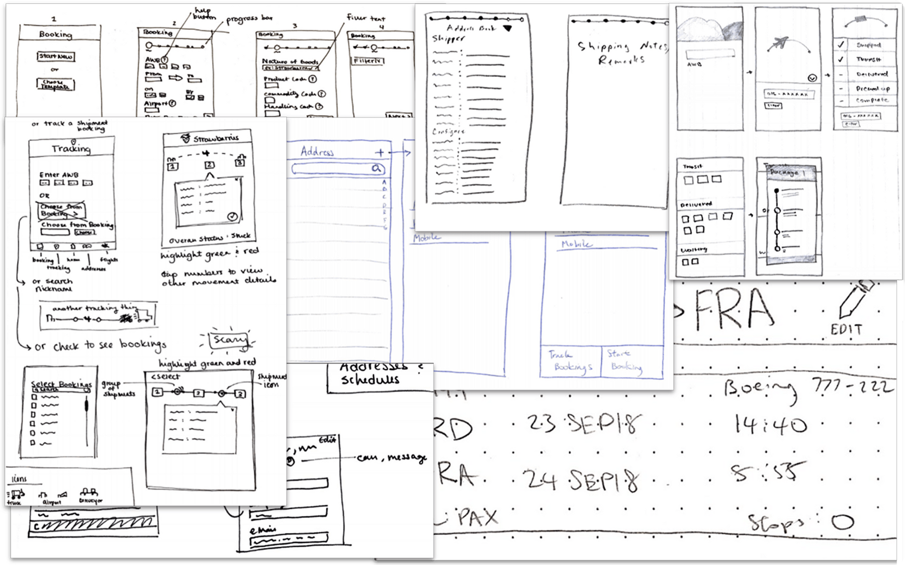
Our team took the core functionalities of cargo booking, shipping and tracking, as well as viewing flight schedules and began to sketch out striaghtforward user flows around these.
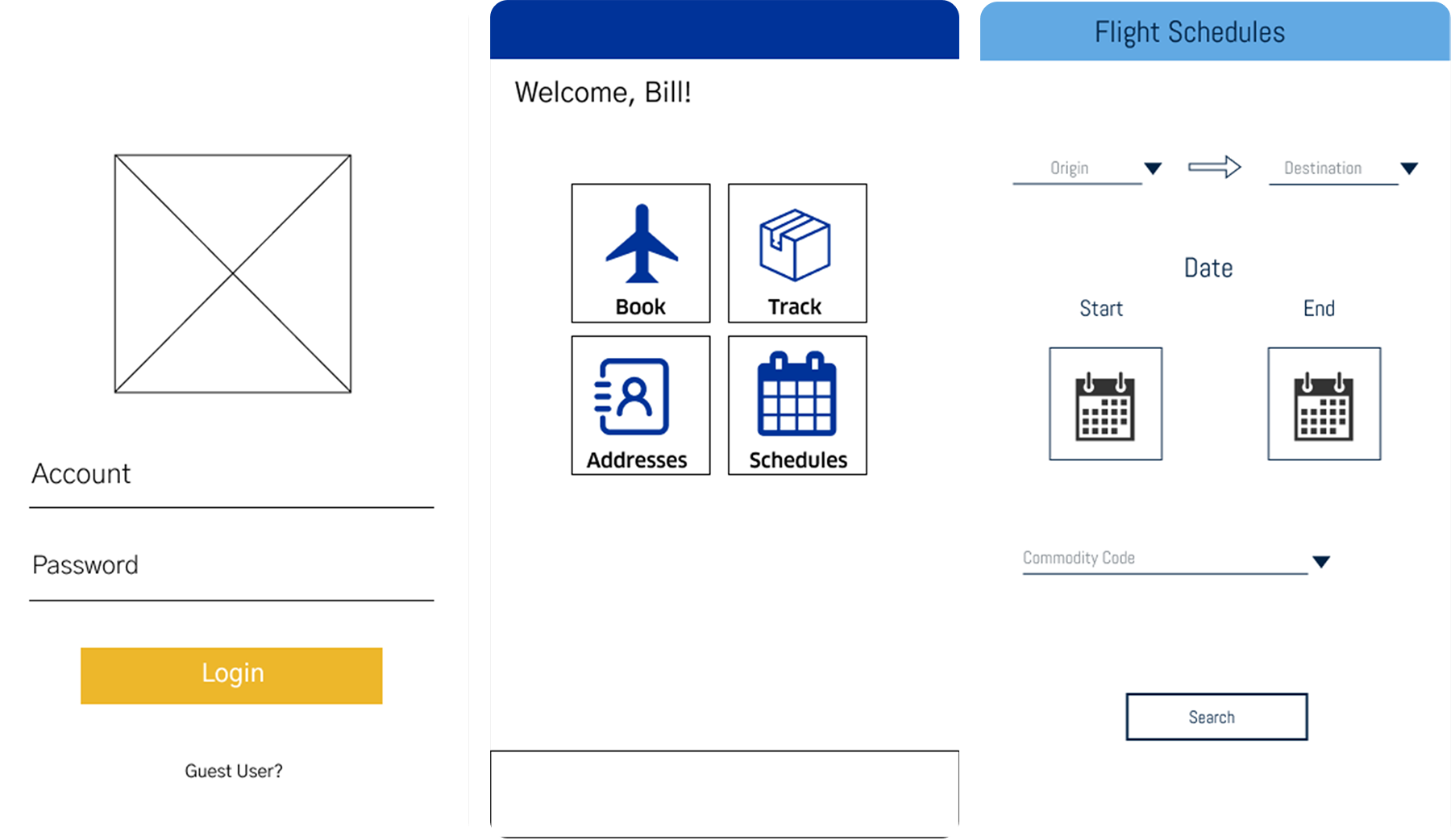
The best features from sketches were grouped and chosen through affinity diagramming to align our key core features. Low-fidelity wireframes then gave shape to these actions to start forming the app skeleton.
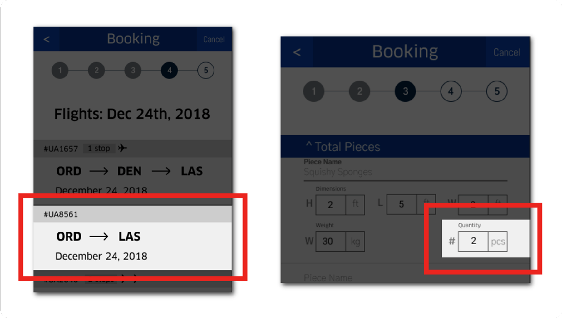
With higher levels of UI fidelity being added and a brand design system taking shape, our team had proper prototypes to test and present in front of users. Users proposed changes to different small and easy-to-miss details around flights and adding pieces.
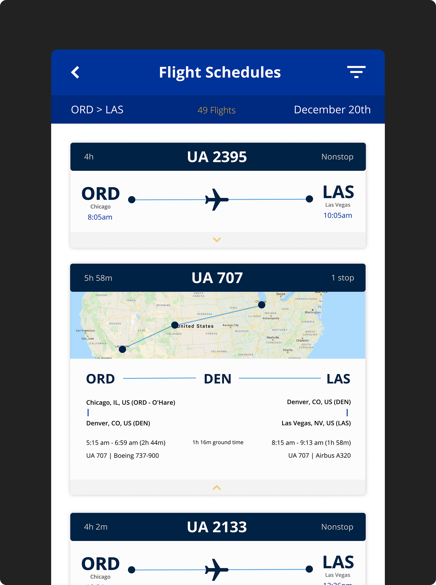
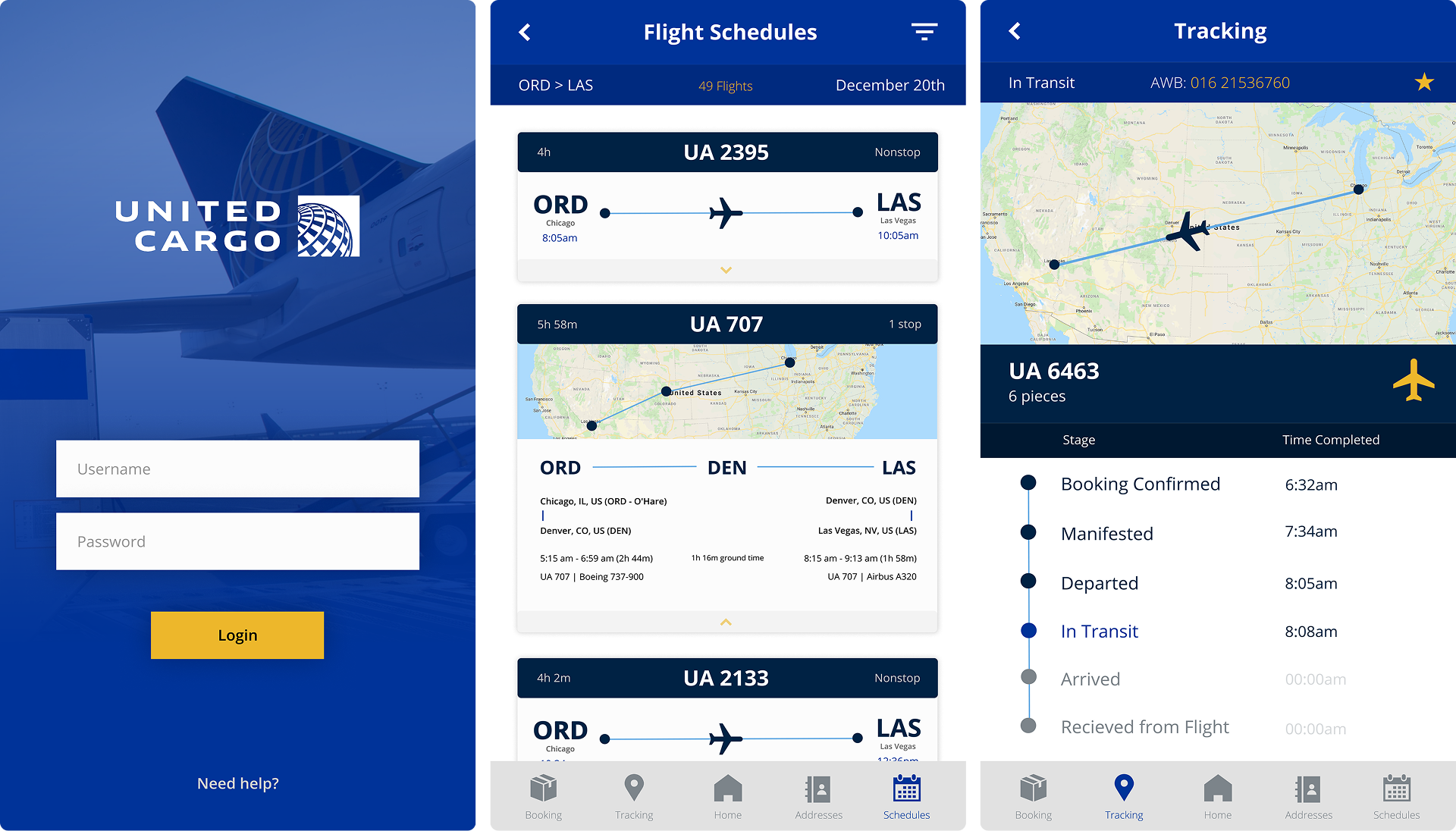
Users can view a feed of availabe flights on which their shipments can be packed and transported. Clear headers and comfortable card style help to create an intuitive mobile selection process.
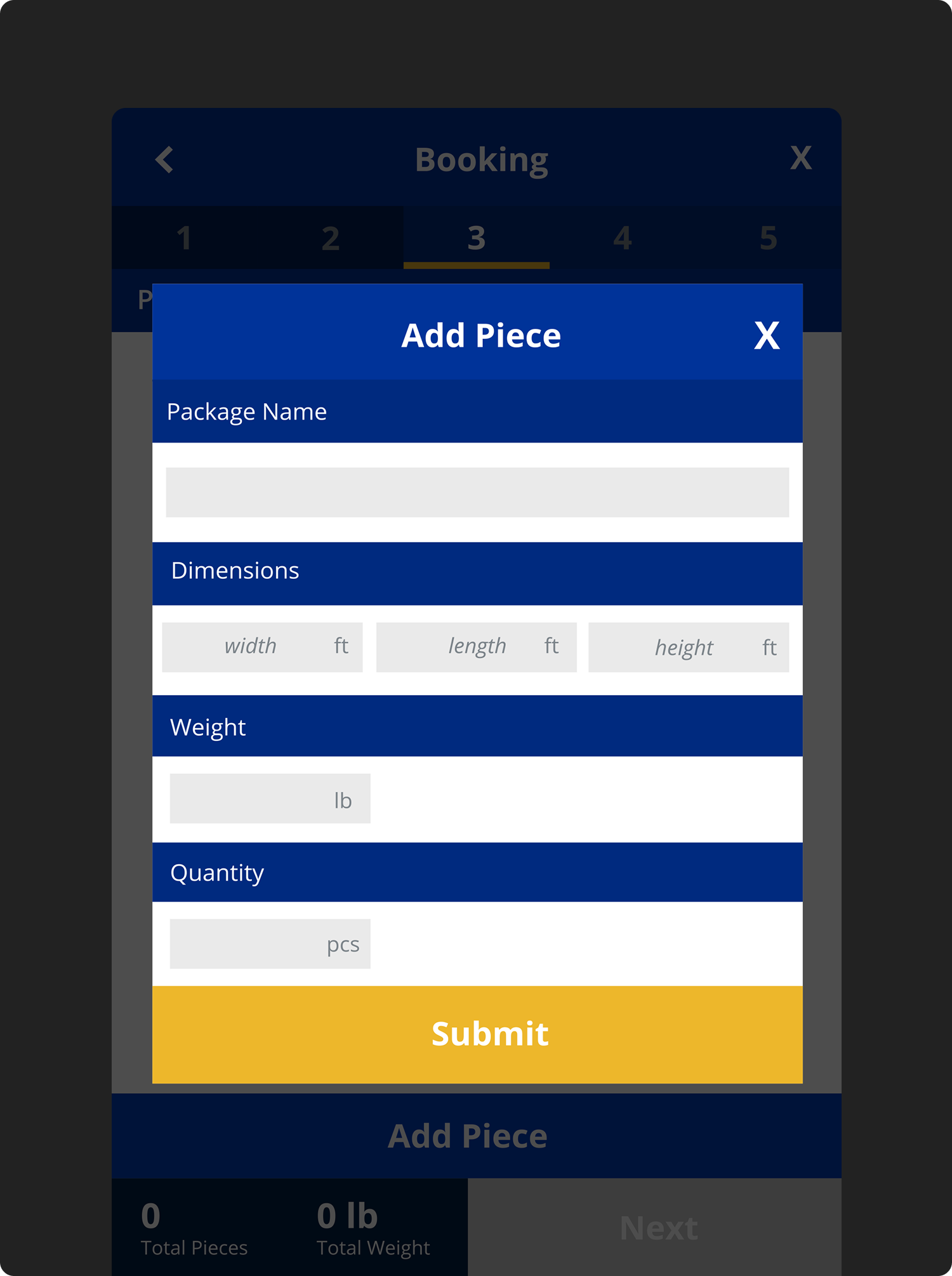
Forms allows users to punch in key details around the items within their cargo shipment. A series of smaller, chunked steps help to lighten up the cognitive load in making decisions.
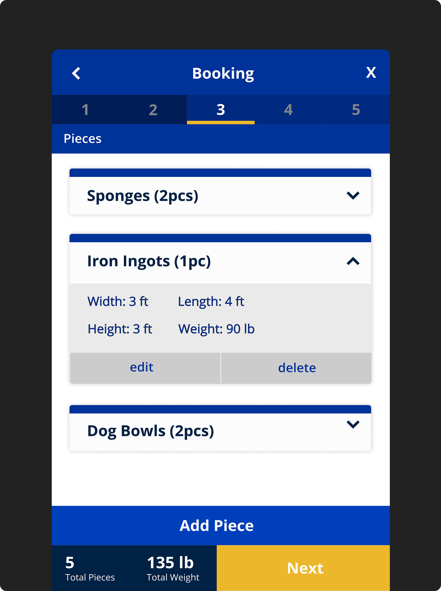
After adding different bookings for cargo shipment, users can review their details. Comfortable buttons and dropdowns allows a pleasant experience for the thumbs. Users now have checkpoints to either edit of they made a mistake or delete different pieces.
After booking a cargo shipment, users can track and analyze key details of the process. A streamlined UI shows only the most pertinent details of the flight tracking journey.
A beautiful, elegant, and brand-aligned UI was designed for the mobile app.
Where there was none, now there is one. Outdated web tools are finally replaced.
Managers now have in field tools to handle unexpected situations.
Looking back at this project after so many years left me with a few final thoughts.
After reviewing this work some time later, I'm proud to see what I could accomplish in undergraduate coursework. I loved how the UI came out for this project.
Different experiential gaps existed and having more time to design out those intermediary screens could help a lot. Also designing for different devices would be great.
I'd like to extend this work into a fully fledged mobile app layout and fill in gaps that we didn't address back then. It would also be great to see some of this be built on a front-end interface with React.